
CSS Accordion
One great thing about CSS is the ability to create great looking designs for your websites and with CSS3 you can write code that does not require javascript (as long as you have the latest web browsers!). In this tutorial we will show you how to design a CSS Accordion without the need of javascript, although you can still get better animations with javascript, this CSS Accordion could still make a great addition to your site design.
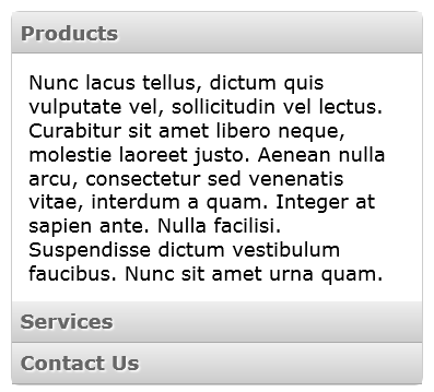
So what is a CSS Accordion? Quite simply a css accordion provides the web user with a container with a range of topics or headings, once the user clicks on a topic a box will display beneath the header with further information.
Please note: This example will only work with web browsers that support CSS3.
Let’s first start by writing the HTML markup for the accordion.
<div class="accordion">
	<ul>
	    <li class="acc-header" id="products">
	        <a href="#products">Products</a>
	        <div class="acc-content">
		        <p>Content goes here...</p>
	        </div>
	    </li>
	    <li class="acc-header" id="services">
	        <a href="#services">Services</a>
	        <div class="acc-content">
		        <p>Content goes here...</p>
	        </div>
	    </li>
	    <li class="acc-header" id="contact">
	        <a href="#contact">Contact Us</a>
	        <div class="acc-content">
		        <p>Content goes here...</p>
	        </div>
	    </li>
	</ul>
</div>
The above markup will give us an accordion with three headings: Products, Services and Contact Us. These heading are made from links that when clicked will open the accordion content below. There are a few examples out there that use labels and radio buttons for the headings, I will add another tutorial later that will deal with those features. As always different methods have pros and cons.
We’ll take a look at the css code now.
Firstly we need to style to container that the accordion will be placed in.
.accordion {
    width: 250px;
    margin: 20px;
    font: 12px Verdana, Geneva, sans-serif;
    border: 1px solid #ccc;
    border-radius: 5px;
}
width:250px; – Specifies the width for our accordion container.
margin: 20px; – This will give a 20px margin around the outside of the container.
font: 12px Verdana, Geneva, sans-serif; – Specifies the font size and font family.
border: 1px solid #ccc; – Will display a 1px wide solid border around our container.
border-radius: 5px; – Gives the corners a rounded look
Next we want to style the content section for our accordion.
.accordion .acc-content {
    height: 0;
    overflow: hidden;
}
.accordion li:target .acc-content {
    height: auto;
    padding: 10px;
}
height: 0; – Sets the initial height of our content to 0.
overflow: hidden; – Hides the information that is displayed in the content area.
height: auto; – When a user clicks on a heading, the height will then be set to auto, to display the content.
padding: 10px; – This will give a 10px padding between the container and the content displayed.
The next step is to style the link headings, when the user clicks on the link then the content will be displayed.
.accordion .acc-header a {
    display:block;
    padding:5px;
    text-decoration: none;
    color: #666;
    text-shadow:1px 1px 1px #fff;
    font-weight:bold;
    border-bottom:1px solid #aaa;
    background:#eee;
    background:linear-gradient(#eee, #ccc);
    transition:.5s;
}
display:block; – Makes it so we can click anywhere in the heading, by displaying the link as a block.
padding:5px; – This will provide a 5px padding around our text.
text-decoration: none; – We don’t want any line to appear below our link, so we set this to none.
color: #666; – The color for the text.
text-shadow:1px 1px 1px #fff; – Just a bit of decoration, gives our text a raised look.
font-weight:bold; – Makes the heading text bold.
border-bottom:1px solid #aaa; – Places a 1px solid border at the bottom of each heading.
background:#eee; – Sets the background of the headings.
background:linear-gradient(#eee, #ccc); – If supported this will give a gradient background to our link.
transition:.5s; – If supported this will animate the text moving when hovering over.
We also now need to give the headings a bit of style when the user hovers their mouse over the headings.
.accordion .acc-header a:hover {
    text-decoration:none;
    border-bottom:1px solid #ddd;
    background:#eee;
    background:linear-gradient(#eee, #ddd);
    padding-left:15px;
}
text-decoration:none; – We don’t want a line to appear below the link, so we set this to none.
border-bottom:1px solid #ddd; – Places a 1px solid border at the bottom of each heading.
background:#eee; – When hovering over the link, this will set the background to #eee.
background:linear-gradient(#eee, #ddd); – If supported this will give a gradient background to our link.
padding-left:15px; – When hovering over the link, this will move our text 15px to the right. (With transition if supported)
Conclusion
Well that’s about all that is required to display a css accordion, in the above css code I have removed all browser specific properties, however, they have been included in the demo and the download link below.
As can be seen from the code, there is no javascript used, this has been achieved using only CSS code, but because it does use CSS3 properties it will not display correctly in older browsers.