
CSS Notification Boxes
Today we are going to look at the design of CSS Notification Boxes. Notification or Alert Boxes are a great way to inform the user of a variety of messages, such as: error messages, success messages, warning messages and general notification. A great example for using these notification boxes would be for user registrations for a website, if for example the user made an error during registration, you could use an alert box to inform the user of the particular error. If however everything was correct, you could alert the user that registration has succeeded and that they can now login.
In this tutorial, we are going to look at how to create a range of the most popular notification boxes, today we are going to focus on the following:
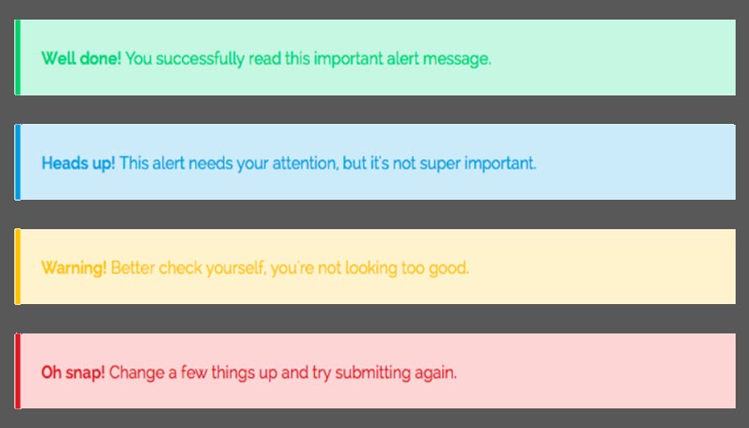
1. Error Box
2. Success Box
3. Warning Box
4. Notice Box

Step 1:
First we will create the basic layout for each box.
.alert-box {
    color:#555;
    border-radius:10px;
    font-family:Tahoma,Geneva,Arial,sans-serif;font-size:11px;
    padding:10px 10px 10px 36px;
    margin:10px;
}
Lets take a look at each line:
color:#555; – This is used for the text color.
border-radius:10px; – We will give the borders a radius of 10px.
font-family:... – Is the name of the font that we will be using.
padding:10px 10px 10px 36px; – Padding inside the box, 10px for Top, Right and Bottom, 36px for Left.
margin:10px; – The margin around the box will be 10px.
Step 2:
In each box there will be a span property notifying the user of the alert.
.alert-box span {
    font-weight:bold;
    text-transform:uppercase;
}
Lets take a look at each line:
font-weight:bold; – All the text inside the span property will be bold.
text-transform:uppercase; – This will transform the text to uppercase.
Step 3:
Now lets add some color and icons to each box.
.error {
    background:#ffecec url('images/error.png') no-repeat 10px 50%;
    border:1px solid #f5aca6;
}
.success {
    background:#e9ffd9 url('images/success.png') no-repeat 10px 50%;
    border:1px solid #a6ca8a;
}
.warning {
    background:#fff8c4 url('images/warning.png') no-repeat 10px 50%;
    border:1px solid #f2c779;
}
.notice {
    background:#e3f7fc url('images/notice.png') no-repeat 10px 50%;
    border:1px solid #8ed9f6;
}
Lets take a look at each line:
background:... – Specifies the background color and the icon used for the alert
border:... – Specifies the border width, style and color.
Step 4:
Lastly we need some HTML code to display the alert boxes.
<div class="alert-box error"><span>error: </span>Write your error message here.</div>
<div class="alert-box success"><span>success: </span>Write your success message here.</div>
<div class="alert-box warning"><span>warning: </span>Write your warning message here.</div>
<div class="alert-box notice"><span>notice: </span>Write your notice message here.</div>
The Result:
You can check out the final result by clicking the button below. Or you can download the demo files.