

Today we have put together a small collection of 10 box shadows that you can use to give your images a bit more flair. The image shadows are created using the box-shadow property and with most examples we also use the :before and :after pseudo elements.
With all of the examples below, I have added a border with padding around the image to make the shadow stand out more, the CSS code used the the border is as follows:
.imgborder {
   display:inline-block;
   position:relative;
   border:1px solid #ccc;
   padding:5px;
   background:#f2f2f2;
   margin-bottom:30px;
}
Image Shadow 1
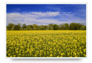
.s1 {
   -webkit-box-shadow: 0 28px 16px -26px rgba(0, 0, 0);
   -moz-box-shadow: 0 28px 16px -26px rgba(0, 0, 0);
   box-shadow: 0 28px 16px -26px rgba(0, 0, 0);
}
Image Shadow 2
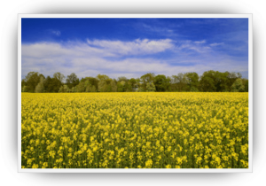
.s2:before, .s2:after {
   position:absolute;
   z-index:-2;
   content:"";
}
.s2:before {
   top:2%;
   bottom:2%;
   left:2%;
   right:2%;
   -webkit-border-radius:15%;
   -moz-border-radius:15%;
   border-radius:15%;
   -webkit-box-shadow:0px -1px 25px rgba(0,0,0,0.5), 0px 1px 25px rgba(0,0,0,0.7);
   -moz-box-shadow:0px -1px 25px rgba(0,0,0,0.5), 0px 1px 25px rgba(0,0,0,0.7);
   box-shadow:0px -1px 25px rgba(0,0,0,0.5), 0px 1px 25px rgba(0,0,0,0.7);
}
Image Shadow 3
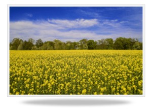
.s3:after {
   content:"";
   position: absolute;
   top:100px;right:0;bottom:0;left: 0;
   z-index:-2;
   -webkit-box-shadow:0px 250px 15px -35px rgba(0,0,0,.25);
   -moz-box-shadow:0px 250px 15px -35px rgba(0,0,0,.25);
   box-shadow:0px 250px 15px -35px rgba(0,0,0,.25);
   -webkit-border-radius:50%;
   -moz-border-radius:50%;
   border-radius:50%;
   transform:scaleY(.3);
   -webkit-transform:scaleY(.3);
   -moz-transform:scaleY(.3);
   -ms-transform:scaleY(.3);
   -o-transform:scaleY(.3);
}
Image Shadow 4
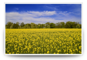
.s4:before, .s4:after {
   content:"";
   position:absolute;
   z-index:-1;
   -webkit-box-shadow:0 0 20px rgba(0,0,0,0.8);
   -moz-box-shadow:0 0 20px rgba(0,0,0,0.8);
   box-shadow:0 0 20px rgba(0,0,0,0.8);
   top:50%;
   bottom:0;
   left:10px;
   right:10px;
   -moz-border-radius:100px / 10px;
   border-radius:100px / 10px;
}
Image Shadow 5

.s5:before {
   position: absolute;
   right: 80px;
   bottom: 5px;
   width: 100%;
   height: 37%;
   border-radius: 0 10% 0 0;
   z-index: -1;
   content: "";
   box-shadow: 86px 0 17px rgba(0,0,0,0.33);
   -webkit-transform: skew(-36deg);
   -moz-transform: skew(-36deg);
   -ms-transform: skew(-36deg);
   -o-transform: skew(-36deg);
   transform: skew(-36deg);
   -webkit-transform-origin: 0% 100%;
   -moz-transform-origin: 0% 100%;
   -ms-transform-origin: 0% 100%;
   -o-transform-origin: 0% 100%;
   transform-origin: 0% 100%;
}
Image Shadow 6

.s6 {
   -webkit-box-shadow:0 1px 4px rgba(0, 0, 0, 0.3);
   -moz-box-shadow:0 1px 4px rgba(0, 0, 0, 0.3);
   box-shadow:0 1px 4px rgba(0, 0, 0, 0.3);
}
.s6:before, .s6:after {
   content:"";
   position:absolute;
   z-index:-1;
   -webkit-box-shadow:0 0 20px rgba(0,0,0,0.8);
   -moz-box-shadow:0 0 20px rgba(0,0,0,0.8);
   box-shadow:0 0 20px rgba(0,0,0,0.8);
   top:10px;
   bottom:10px;
   left:0;
   right:0;
   -moz-border-radius:100px / 10px;
   border-radius:100px / 10px;
}
.s6:after {
   right:10px;
   left:auto;
   -webkit-transform:skew(8deg) rotate(3deg);
   -moz-transform:skew(8deg) rotate(3deg);
   -ms-transform:skew(8deg) rotate(3deg);
   -o-transform:skew(8deg) rotate(3deg);
   transform:skew(8deg) rotate(3deg);
}
Image Shadow 7

.s7:before {
   z-index: -1;
   position: absolute;
   content: "";
   width: 98%;
   height: 96%;
   bottom: 0px;
   right: 0px;
   background: #eee;
   border: 1px solid #ccc;
   box-shadow: 1px 1px 8px rgba(0,0,0,0.1);
   -webkit-transform: skew(2deg,2deg) translate(3px,5px);
   -moz-transform: skew(2deg,2deg) translate(3px,5px);
   -ms-transform: skew(2deg,2deg) translate(3px,5px);
   -o-transform: skew(2deg,2deg) translate(3px,5px);
   transform: skew(2deg,2deg) translate(3px,5px);
}
.s7:after {
   z-index: -1;
   position: absolute;
   content: "";
   width: 98%;
   height: 96%;
   bottom: 0px;
   right: 0px;
   background: #eee;
   border: 1px solid #ccc;
   box-shadow: 0 0 8px rgba(0,0,0,0.1);
   -webkit-transform: skew(2deg,2deg) translate(1px,0px);
   -moz-transform: skew(2deg,2deg) translate(1px,0px);
   -ms-transform: skew(2deg,2deg) translate(1px,0px);
   -o-transform: skew(2deg,2deg) translate(1px,0px);
   transform: skew(2deg,2deg) translate(1px,0px);
}
Image Shadow 8
.s8:before, .s8:after {
   z-index: -1;
   position: absolute;
   content: "";
   bottom: 25px;
   left: 10px;
   width: 50%;
   top: 80%;
   max-width:300px;
   background: #777;
   -webkit-box-shadow: 0 35px 20px #777;
   -moz-box-shadow: 0 35px 20px #777;
   box-shadow: 0 35px 20px #777;
   -webkit-transform: rotate(-8deg);
   -moz-transform: rotate(-8deg);
   -o-transform: rotate(-8deg);
   -ms-transform: rotate(-8deg);
   transform: rotate(-8deg);
}
.s8:after {
   -webkit-transform: rotate(8deg);
   -moz-transform: rotate(8deg);
   -o-transform: rotate(8deg);
   -ms-transform: rotate(8deg);
   transform: rotate(8deg);
   right: 10px;
   left: auto;
}
Image Shadow 9

.s9:before, .s9:after {
   z-index: -1;
   position: absolute;
   content: "";
   bottom: 15px;
   left: 10px;
   width: 50%;
   top: 80%;
   max-width:300px;
   background: #777;
   -webkit-box-shadow: 0 15px 10px #777;
   -moz-box-shadow: 0 15px 10px #777;
   box-shadow: 0 15px 10px #777;
   -webkit-transform: rotate(-3deg);
   -moz-transform: rotate(-3deg);
   -o-transform: rotate(-3deg);
   -ms-transform: rotate(-3deg);
   transform: rotate(-3deg);
}
.s9:after {
   -webkit-transform: rotate(3deg);
   -moz-transform: rotate(3deg);
   -o-transform: rotate(3deg);
   -ms-transform: rotate(3deg);
   transform: rotate(3deg);
   right: 10px;
   left: auto;
}
Image Shadow 10

.s10:after {
   z-index: -1;
   position: absolute;
   content: "";
   bottom: 15px;
   right: 10px;
   left: auto;
   width: 50%;
   top: 80%;
   max-width:300px;
   background: #777;
   -webkit-box-shadow: 0 15px 10px #777;
   -moz-box-shadow: 0 15px 10px #777;
   box-shadow: 0 15px 10px #777;
   -webkit-transform: rotate(3deg);
   -moz-transform: rotate(3deg);
   -o-transform: rotate(3deg);
   -ms-transform: rotate(3deg);
   transform: rotate(3deg);
}
All of the examples above are saved png images with the shadow, to view examples of the images with the CSS code applied, please check out the example page here.