CSS PortalCSS Portal
Menu
  • CSS Generators
  • CSS Resources
  • CSS Tools
  • HTML Resources
  • Blog
  1. Home
  2. Blog
  3. Style Checkboxes and Radio Buttons

Style Checkboxes and Radio Buttons

Published on April 12, 2014By Rene Spronk

In this tutorial we are going to show you how to style checkboxes and radio buttons using only CSS code. By customizing these two elements, you’ll be able to keep your webpage colors and styles consistent with other elements on your page. The way we style the checkbox and radio button is by making the two elements invisible and then using CSS to create a new checkbox or radio button.

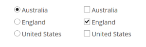
We’ll also be using the pseudo class :checked to alter our buttons to become selected or not. Take a look at the following images and I’m sure you will agree that the styled elements look better than the default ones.

Before:
Style Radio buttons
After:
Style Checkboxes

Ok, lets get down to the code and see how the achieve this effect.
Firstly we will use the following HTML code:

<!--Code for Radio Buttons-->
<input type="radio" id="rb1" name="rb" value="" checked>
<label for="rb1">Australia</label><br>
<input type="radio" id="rb2" name="rb"value="">
<label for="rb2">England</label><br>
<input type="radio" id="rb3" name="rb" value="">
<label for="rb3">United States</label>

<!--Code for Checkbox-->
<input type="checkbox" id="cb1" name="cb" value="">
<label for="cb1">Australia</label><br>
<input type="checkbox" id="cb2" name="cb"value="" checked>
<label for="cb2">England</label><br>
<input type="checkbox" id="cb3" name="cb" value="">
<label for="cb3">United States</label>

The above code will display three radio buttons and three checkboxes, obviously you can add more but you will need to keep the name the same for your radio buttons or checkboxes.
That’s basically all we need for the HTML, now lets get on with the CSS to style each element. We’ll break the CSS down into three sections and explain each one.

Step 1

input[type=radio], input[type=checkbox] {
    display:none;
}

This first section is pretty straight forward, what we are doing here is making sure that our un-styled radio and checkbox will not be displayed.

Step 2

input[type=radio] + label:before {
    content: "";  
    display: inline-block;  
    width: 15px;  
    height: 15px;  
    vertical-align:middle;
    margin-right: 8px;  
    background-color: #aaa;  
    box-shadow: inset 0px 2px 2px rgba(0, 0, 0, .3);
    border-radius: 8px;  
}
input[type=checkbox] + label:before {
    content: "";  
    display: inline-block;  
    width: 15px;  
    height: 15px;  
    vertical-align:middle;
    margin-right: 8px;  
    background-color: #aaa;  
    box-shadow: inset 0px 2px 2px rgba(0, 0, 0, .3);
    border-radius: 4px;  
}

Now that our default buttons are hidden, we need to draw new buttons for the user to click on. The :before pseudo class is used to create our new image before the HTML label tag. We’ll now look at the main properties used in this section.
content: – We don’t want anything displayed before the label.
display: – Our new checkbox/radio will be displayed inline-block.
vertical-align: – We need this property to keep the new checkbox/radio aligned with our text.
margin-right: – Space between the checkbox/radio and the label.
box-shadow: – Lets give our new checkbox/radio an inset shadow to soften the edges.
border-radius: – Here we will make our radio button into a circle and the checkbox will have slightly rounded corners.

Step 3

input[type=radio]:checked + label:before {
    content: "\2022"; /* Bullet */
    color:white;
    background-color: #666; 
    font-size:1.8em;
    text-align:center;
    line-height:14px;
    text-shadow:0px 0px 3px #eee;
}
input[type=checkbox]:checked + label:before {
    content:"\2714"; /* Tick */
    color:white;
    background-color: #666; 
    text-align:center;
    line-height:15px;
    text-shadow:0px 0px 3px #eee;
}

The last section is needed to display that the user has selected a checkbox/radio button. Once selected the checkbox/radio button will have either a ‘tick’ or ‘bullet’ image display. Here we also use the :checked pseudo class which will work in all modern web browsers, older browsers will not work.
content: – To show that we selected the button, we display either a ‘tick’ or ‘bullet’ image.
text-align: – Here we will center the above ‘tick’ or ‘bullet’ (Horizontally).
line-height: – Used to center the ‘tick’ or ‘bullet’ (Vertically).

That’s all that is needed to style our checkbox and radio buttons, we have only shown how to create our own box or circle, but you can also use an image to style these elements.

If you want to check out a demo and play around with it a bit, just click on the button below.

Demo


Share this Page

If you have enjoyed using CSSPortal, please consider sharing this page with other users, just click on your preferred social media link or copy the webpage from the link below.

URL
Sidebar

CSS & HTML References

  • CSS At-Rules
    • @charset
    • @document
    • @font-face
    • @import
    • @keyframes
    • @media
    • @namespace
    • @page
    • @supports
    • @viewport
  • CSS Data Types
    • angle
    • basic-shape
    • blend-mode
    • color
    • frequency
    • gradient
    • image
    • integer
    • length
    • number
    • percentage
    • position
    • ratio
    • resolution
    • string
    • time
    • url
  • CSS Functions
    • attr
    • blur
    • brightness
    • calc
    • circle
    • contrast
    • drop-shadow
    • ellipse
    • grayscale
    • hsl
    • hsla
    • hue-rotate
    • inset
    • invert
    • linear-gradient
    • matrix
    • matrix3d
    • opacity
    • perspective
    • polygon
    • radial-gradient
    • repeating-linear-gradient
    • repeating-radial-gradient
    • rgb
    • rgba
    • rotate
    • rotate3d
    • rotateX
    • rotateY
    • rotateZ
    • saturate
    • scale
    • scale3d
    • scaleX
    • scaleY
    • scaleZ
    • sepia
    • skew
    • skewX
    • skewY
    • translate
    • translate3d
    • translateX
    • translateY
    • translateZ
  • CSS Properties
    • align-content
    • align-items
    • align-self
    • all
    • animation
    • animation-delay
    • animation-direction
    • animation-duration
    • animation-fill-mode
    • animation-iteration-count
    • animation-name
    • animation-play-state
    • animation-timing-function
    • backface-visibility
    • background
    • background-attachment
    • background-blend-mode
    • background-clip
    • background-color
    • background-image
    • background-origin
    • background-position
    • background-repeat
    • background-size
    • border
    • border-bottom
    • border-bottom-color
    • border-bottom-left-radius
    • border-bottom-right-radius
    • border-bottom-style
    • border-bottom-width
    • border-collapse
    • border-color
    • border-image
    • border-image-outset
    • border-image-repeat
    • border-image-slice
    • border-image-source
    • border-image-width
    • border-left
    • border-left-color
    • border-left-style
    • border-left-width
    • border-radius
    • border-right
    • border-right-color
    • border-right-style
    • border-right-width
    • border-spacing
    • border-style
    • border-top
    • border-top-color
    • border-top-left-radius
    • border-top-right-radius
    • border-top-style
    • border-top-width
    • border-width
    • bottom
    • box-decoration-break
    • box-shadow
    • box-sizing
    • break-after
    • break-before
    • break-inside
    • caption-side
    • caret-color
    • clear
    • clip-path
    • color
    • column-count
    • column-fill
    • column-rule
    • column-rule-color
    • column-rule-style
    • column-rule-width
    • column-span
    • column-width
    • columns
    • content
    • counter-increment
    • counter-reset
    • counter-set
    • cursor
    • direction
    • display
    • empty-cells
    • filter
    • flex
    • flex-basis
    • flex-direction
    • flex-flow
    • flex-grow
    • flex-shrink
    • flex-wrap
    • float
    • font
    • font-family
    • font-feature-settings
    • font-kerning
    • font-language-override
    • font-size
    • font-size-adjust
    • font-stretch
    • font-style
    • font-synthesis
    • font-variant
    • font-variant-alternates
    • font-variant-caps
    • font-variant-east-asian
    • font-variant-ligatures
    • font-variant-numeric
    • font-variant-position
    • font-weight
    • grid
    • grid-area
    • grid-auto-columns
    • grid-auto-flow
    • grid-auto-rows
    • grid-column
    • grid-column-end
    • grid-column-gap
    • grid-column-start
    • grid-gap
    • grid-row
    • grid-row-end
    • grid-row-gap
    • grid-row-start
    • grid-template
    • grid-template-areas
    • grid-template-columns
    • grid-template-rows
    • hanging-punctuation
    • height
    • hyphens
    • image-orientation
    • justify-content
    • justify-items
    • justify-self
    • left
    • letter-spacing
    • line-break
    • line-height
    • list-style
    • list-style-image
    • list-style-position
    • list-style-type
    • margin
    • margin-bottom
    • margin-left
    • margin-right
    • margin-top
    • max-height
    • max-width
    • min-height
    • min-width
    • mix-blend-mode
    • object-fit
    • object-position
    • opacity
    • order
    • orphans
    • outline
    • outline-color
    • outline-offset
    • outline-style
    • outline-width
    • overflow
    • overflow-wrap
    • overflow-x
    • overflow-y
    • padding
    • padding-bottom
    • padding-left
    • padding-right
    • padding-top
    • perspective
    • perspective-origin
    • place-content
    • place-items
    • place-self
    • position
    • quotes
    • resize
    • right
    • shape-image-threshold
    • shape-margin
    • shape-outside
    • tab-size
    • table-layout
    • text-align
    • text-align-last
    • text-combine-upright
    • text-decoration
    • text-decoration-color
    • text-decoration-line
    • text-decoration-style
    • text-emphasis
    • text-emphasis-color
    • text-emphasis-position
    • text-emphasis-style
    • text-indent
    • text-justify
    • text-orientation
    • text-overflow
    • text-shadow
    • text-transform
    • text-underline-position
    • top
    • transform
    • transform-origin
    • transform-style
    • transition
    • transition-delay
    • transition-duration
    • transition-property
    • transition-timing-function
    • unicode-bidi
    • vertical-align
    • visibility
    • white-space
    • widows
    • width
    • word-break
    • word-spacing
    • word-wrap
    • writing-mode
    • z-index
  • CSS Pseudo Classes
    • :active
    • :checked
    • :default
    • :disabled
    • :empty
    • :enabled
    • :first-child
    • :first-of-type
    • :focus
    • :fullscreen
    • :hover
    • :in-range
    • :indeterminate
    • :invalid
    • :lang
    • :last-child
    • :last-of-type
    • :link
    • :not
    • :nth-child
    • :nth-last-child
    • :nth-last-of-type
    • :nth-of-type
    • :only-child
    • :only-of-type
    • :optional
    • :out-of-range
    • :read-only
    • :read-write
    • :required
    • :root
    • :target
    • :valid
    • :visited
  • CSS Pseudo Elements
    • ::after
    • ::before
    • ::first-letter
    • ::first-line
    • ::placeholder
    • ::selection
  • HTML Tags
    • a
    • abbr
    • address
    • area
    • article
    • aside
    • audio
    • b
    • base
    • bdi
    • bdo
    • blockquote
    • body
    • br
    • button
    • canvas
    • caption
    • cite
    • code
    • col
    • colgroup
    • comment
    • datalist
    • dd
    • del
    • details
    • dfn
    • dialog
    • div
    • dl
    • doctype
    • dt
    • em
    • embed
    • fieldset
    • figcaption
    • figure
    • footer
    • form
    • h1
    • h2
    • h3
    • h4
    • h5
    • h6
    • head
    • header
    • hr
    • html
    • i
    • iframe
    • img
    • input
    • ins
    • kbd
    • keygen
    • label
    • legend
    • li
    • link
    • map
    • mark
    • menu
    • meta
    • meter
    • nav
    • noscript
    • object
    • ol
    • optgroup
    • option
    • output
    • p
    • param
    • picture
    • pre
    • progress
    • q
    • rp
    • rt
    • ruby
    • s
    • samp
    • script
    • section
    • select
    • small
    • source
    • span
    • strong
    • style
    • sub
    • summary
    • sup
    • table
    • tbody
    • td
    • textarea
    • tfoot
    • th
    • thead
    • time
    • title
    • tr
    • track
    • u
    • ul
    • var
    • video
    • wbr
  • Sponsors
  • Turn Website into App
    Convert your website into an app for Android and iOS. Updates automatically.
    Unicode Characters & Emojis
    Search all Unicode characters and emojis plus other tools.
    Learn Wordpress
    Wordpress hosting. Theme and plugin reviews. Wordpress development tips.
    Templatic
    Wordpress Themes, Cloud Hosting, Backups and Webmaster Tips.
    A2 Web Hosting
    Shared hosting, Reseller hosting, Cloud hosting, Dedicated hosting.
    Online Password Manager
    Access your passwords from any computer, no need to remember all of your passwords.
    Advertise Here
    Advertise your company and products here!

    About CSSPortal

    CSS Portal is home to many examples of CSS and how it can be used in website design. Here you'll find all CSS properties and many CSS generators to help with all your design needs.

    Friends

    • Expand URL
    • Password Manager
    • Website Tools & Generators

    CSSPortal

    • Donate to CSSPortal
    • Privacy Policy
    • Contact Us
    • CSS Blog

    Copyright © 2023, CSSPortal.com All rights reserved.