
CSS Data Type

Description
The <angle> CSS data type represents a rotational measurement in a two-dimensional plane. Angles are used in a variety of CSS properties to define rotations, directions, or orientations. They are particularly common in properties such as transform for rotating elements, gradients like linear-gradient() for specifying color directions, and rotate() functions within transforms. An deg), radians (rad), gradians (grad), and turns (turn).
Angles in CSS follow a clockwise rotation by default, starting from the positive x-axis (the right side). Negative values rotate counterclockwise. This behavior is crucial when animating elements or positioning gradients, as the visual effect depends on both the magnitude and direction of the angle. Additionally, angles can be combined with other CSS data types in functional notations, for example, combining translate() or using them with clip-path shapes.
Here are some practical examples of
/* Rotating an element 45 degrees */
.box {
  transform: rotate(45deg);
}

/* Creating a diagonal gradient at 135 degrees */
.gradient {
  background: linear-gradient(135deg, red, blue);
}

/* Using radians for a precise rotation */
.circle {
  transform: rotate(3.1416rad); /* ~180 degrees */
}

/* Using turns for a full rotation */
.spinner {
  animation: spin 1s linear infinite;
}

@keyframes spin {
  from { transform: rotate(0turn); }
  to { transform: rotate(1turn); }
}
The <angle> type allows designers and developers to control visual direction and rotation in a precise and flexible way. Its support across many properties makes it a foundational data type for animations, gradients, and geometric transformations in CSS.
Here’s a visual comparison of the <angle> units in CSS, showing how each represents the same rotation:
| Unit | Equivalent | Notes |
|---|---|---|
| deg | 90deg | Degrees; full circle = 360deg |
| rad | 1.5708rad | Radians; full circle = 2π rad |
| grad | 100grad | Gradians; full circle = 400grad |
| turn | 0.25turn | Turns; full circle = 1 turn |
Example with all units
.box-deg {
  transform: rotate(90deg);
}

.box-rad {
  transform: rotate(1.5708rad); /* same as 90deg */
}

.box-grad {
  transform: rotate(100grad); /* same as 90deg */
}

.box-turn {
  transform: rotate(0.25turn); /* same as 90deg */
}
This shows that no matter which unit you choose, they all represent the same angle if converted correctly. Using deg is most common, but turn is very handy for animations because fractions of a turn are easy to reason about.
Syntax
property: <angle>;
Values
- degRepresents an angle in degrees. There are 360 degrees in a full circle.
- gradRepresents an angle in gradians. There are 400 gradians in a full circle.
- radRepresents an angle in radians. There are 2π radians in a full circle.
- turnRepresents an angle in a number of turns. There is 1 turn in a full circle.
The values of some angles are presented in the table below:
 |
90deg = 100grad = 0.25turn ≈ 1.5708rad |
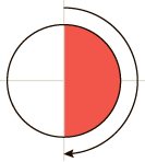 |
180deg = 200grad = 0.5turn ≈ 3.1416rad |
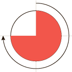 |
270deg = 300grad = 0.75turn ≈ 4.7124rad |
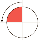 |
-90deg = -100grad = -0.25turn ≈ -1.5708rad |
Example
Browser Support
The following information will show you the current browser support for the CSS angle data type. Hover over a browser icon to see the version that first introduced support for this CSS data type.
This data type is supported by all modern browsers.
Desktop


Tablets & Mobile


Last updated by CSSPortal on: 3rd January 2026