
CSS Grid Generator
The CSS Grid Generator is a web-based tool designed to help users easily create CSS grid layouts for web design. This online tool offers a user-friendly interface where you can visually configure the grid structure, including defining the number of rows and columns, setting the size of grid gaps, and customizing other aspects such as alignment and areas. Once the layout is configured, the tool will automatically generate the corresponding CSS and HTML code, which can be directly copied and used in your web project. The purpose of this tool is to simplify the process of creating complex, responsive grid layouts without manually writing all the CSS code, making it accessible even to those with limited coding experience.

CSS Grid Options / Preview
How to Use
We've designed this CSS Grid Generator to be intuitive and easy to explore. The best way to learn is to experiment, but the steps below will get you up and running quickly.
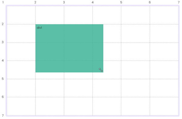
1. Add a div to the grid
Click on any empty cell to add a new div element to the grid.

2. Resize an element
Use the resize handle in the lower-right corner of an element to adjust its size within the grid.
3. Move elements
Click and drag the move icon to reposition an element anywhere on the grid.

4. Adjust grid settings
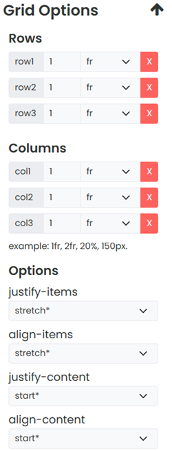
Use the top toolbar to control the number of rows and columns, as well as the spacing between grid items.

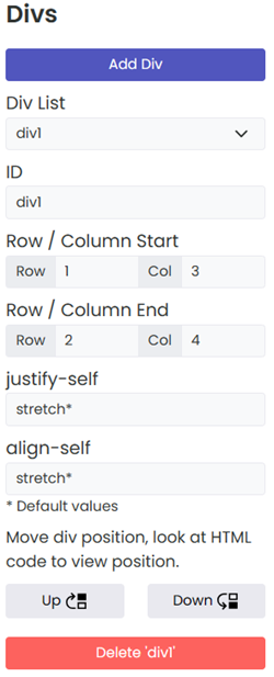
5. Fine-tune and preview
The right-hand toolbar lets you add and configure individual divs, tweak grid settings, and preview the finished layout in a new window.

About CSS Grid Generator
Welcome to our CSS Grid Generator, your ultimate solution for crafting seamless and responsive CSS grid layouts! Our tool is designed to empower both novice and experienced web developers by simplifying the process of creating complex grid systems for web pages and applications.
- User-Friendly Interface: With our intuitive interface, you can easily define the structure of your grid. Adjust rows, columns, and gaps with a few clicks to fit your design needs.
- Real-Time Preview: Instantly see how your grid looks and behaves on different devices. Our live preview feature ensures that what you see is what you get.
- Customizable Settings: From aligning items to setting specific areas for your content, our generator offers extensive customization options to make your grid truly unique.
- Code Generation: Once you're satisfied with your layout, our tool generates clean, efficient, and cross-browser compatible CSS code, ready to be integrated into your project.
At CSS Portal, we strive to make web design more accessible and efficient. We believe that a powerful grid system is key to creating responsive, aesthetically pleasing, and user-friendly websites. Our tool is continuously updated to incorporate the latest web standards and technologies, ensuring you stay ahead in the ever-evolving world of web development.
Frequently Asked Questions
What is CSS Grid and what is it used for?
CSS Grid is a two-dimensional layout system built into CSS that lets you position elements into rows and columns simultaneously.
Unlike Flexbox, which works along a single axis at a time, Grid gives you direct control over both dimensions at once, making it ideal for building full page layouts, dashboards, image galleries, and any design where items need to align both horizontally and vertically.
You enable it by setting display: grid on a container element.
What is the difference between CSS Grid and Flexbox?
Flexbox is a one-dimensional layout system - it arranges items either in a row or a column, but not both at the same time. CSS Grid is two-dimensional - it manages rows and columns simultaneously, giving you precise control over where items sit in both directions. In practice, Grid is better suited to overall page structure and complex layouts, while Flexbox is ideal for aligning items within a single row or column, such as a navigation bar or a card's internal layout. The two are designed to complement each other and are often used together on the same page.
What does the fr unit mean in CSS Grid?
fr stands for "fraction" and represents a share of the available space in the grid container after fixed and content-sized tracks have been accounted for.
For example, grid-template-columns: 1fr 2fr 1fr creates three columns where the middle column gets twice as much space as either of the outer columns.
It is similar to the flex-grow concept in Flexbox and is the recommended unit for creating flexible, proportional grid tracks that adapt naturally to different screen sizes.
What is the difference between grid-template-columns and grid-auto-columns?
grid-template-columns explicitly defines the size of each column track in the grid. If you write grid-template-columns: 1fr 1fr 1fr, you are creating exactly three equal columns.
grid-auto-columns controls the size of any implicitly created columns - columns that the browser generates automatically when grid items are placed outside the explicitly defined tracks.
Think of grid-template-columns as the columns you planned for, and grid-auto-columns as the rule for any extra columns the browser needs to create to fit your content.
How do I make a grid item span multiple columns or rows?
Use the grid-column and grid-row properties on the item itself.
For example, grid-column: 1 / 3 makes the item start at column line 1 and end at column line 3, spanning two columns.
You can also use the span keyword: grid-column: span 2 means "take up two columns from wherever this item is placed."
The same approach works for rows using grid-row.
What is the repeat() function in CSS Grid?
repeat() is a shorthand for repeating a track definition a set number of times, avoiding redundant declarations.
For example, grid-template-columns: repeat(4, 1fr) is equivalent to writing 1fr 1fr 1fr 1fr.
It also accepts the keywords auto-fill and auto-fit in place of a fixed number, which tells the browser to create as many tracks as will fit in the container - a powerful technique for responsive grids that require no media queries.
What is the difference between auto-fill and auto-fit in CSS Grid?
Both are used with repeat() to create as many columns as will fit the container.
The difference appears when there are fewer items than available tracks.
auto-fill keeps the empty tracks in place, preserving the grid structure even if some columns are unfilled.
auto-fit collapses empty tracks to zero width, allowing the existing items to expand and fill the remaining space.
For most responsive card or gallery layouts, auto-fit with minmax() is the more useful choice.
What does minmax() do in CSS Grid?
minmax(min, max) defines a size range for a grid track - the track will be at least as wide as min and at most as wide as max.
It is most commonly used in responsive layouts: grid-template-columns: repeat(auto-fit, minmax(200px, 1fr)) creates as many columns as will fit, each at least 200px wide, expanding equally to fill any remaining space.
This pattern produces a fully responsive multi-column layout with no media queries needed.
What is grid-gap and how does it work?
gap (formerly grid-gap) sets the spacing between rows and columns in a grid. You can set both at once with a single value like gap: 16px, or separately with row-gap and column-gap.
Importantly, gap only creates space between tracks - it does not add space on the outer edges of the grid. If you need outer spacing, use padding on the grid container instead.
The grid-gap name still works in all browsers but gap is the modern standard and is now also supported in Flexbox.
What is the difference between justify-items and justify-content in CSS Grid?
justify-items controls how each individual grid item is aligned within its own cell along the inline (horizontal) axis. The default is stretch, which makes items fill their cell.
justify-content controls how the entire grid - all the tracks together - is aligned within the grid container when the total grid size is smaller than the container.
In short: justify-items aligns content inside cells, justify-content aligns the grid itself inside its container. The same distinction applies to align-items vs align-content on the block (vertical) axis.
What is grid-template-areas and how do I use it?
grid-template-areas lets you define a named layout map for your grid using plain text, making complex layouts much easier to read and maintain.
You assign names to areas in the template, then reference those names on individual grid items using the grid-area property.
For example, a classic page layout might define a header spanning the full width, a sidebar and main content side by side, and a footer below - all described visually as a grid of named strings in your CSS.
A period (.) represents an empty cell in the template.
What browsers support CSS Grid?
CSS Grid has full support in all modern browsers - Chrome 57+, Firefox 52+, Safari 10.1+, and Edge 16+. It covers well over 97% of global browser usage.
The original implementation was prefixed in some older browsers, but no prefixes are required today.
If you need to support very old browsers, a Flexbox or float-based fallback can be provided using @supports to detect grid support and serve the appropriate layout.
Grid Layouts
Empty Grids


Website Grids


Other Grids


