CSS PortalCSS Portal
Menu
  • CSS Generators
  • CSS Resources
  • CSS Tools
  • HTML Resources
  • Blog
  1. Home
  2. Blog
  3. Animated Share Bar

Animated Share Bar

Published on March 1, 2015By Rene Spronk

A lot of websites use social media to share their work with other users and bring in extra visitors to their site. In this tutorial, we will create a simple animated share bar using only CSS that you can add to your site. You will just need to change the links to direct the end user to your social media pages.

share-front
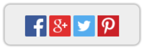
The above image is the share bar that your user will see, when they hover over the share bar, that is when the bar will animate to show the social media to click on, as in the image below.
share-back

Updated to now work with Internet Explorer.

Enough talk, lets get down to the code, firstly we will look at the HTML code used to display the bar.

<div class="share-container">
    <div class="flip-div">
        <div class="front">
            Share This Page
        </div>
        <div class="back">
            <a href="http://www.facebook.com"><img alt="facebook" src="facebook.png"></a>
            <a href="http://www.google.com"><img alt="google" src="google.png"></a>
            <a href="http://www.twitter.com"><img alt="twitter" src="twitter.png"></a>
            <a href="http://www.pinterest.com"><img alt="twitter" src="pinterest.png"></a>
        </div>
    </div>
</div>

We’ll break the code down a bit:
share-container – Is the container that will hold our share bar.
front – Any code displayed here will show when the user is not hovering over the bar.
back – This is what will be displayed when the user hovers over the bar.

Now onto the CSS code that will add our animation and all styles for the share bar.

.share-container {
   perspective: 1000;
   transform-style: preserve-3d;
}
.share-container, .front, .back {
   width: 200px;
   height: 60px;
}
.share-container:hover .back {
   transform: rotateY(0deg);
}
.share-container:hover .front {
   transform: rotateY(180deg);
}

.front, .back {
   border:2px solid #CCC;
   border-radius:10px;
   line-height:60px;
   text-align:center;
   background:#EEE;
   box-shadow:0 0 2px #aaa;
   backface-visibility: hidden;
   transition: 0.6s;
   transform-style: preserve-3d;
   position: absolute;
   top: 0;
   left: 0;
}
.flip-div {
   transition: 0.6s;
   transform-style: preserve-3d;
   position: relative;
}
.front {
   z-index: 2;
   color:#666;
   text-shadow:0 0 3px #fff;
   font-size:1.3em;
   font-family:"Gill Sans", "Gill Sans MT", Calibri, "Trebuchet MS", sans-serif;
   transform: rotateY(0deg);
}
.back {
   transform: rotateY(-180deg);
}
.back img {
   vertical-align:middle;
}

The code used to animate the share bar is the transform and transform-style property. To view more information on these properties, please check out our transform property and transform-style property pages.

That’s all for this blog, feel free to use the code in your own websites and hopefully you’ll be able to get extra visitors and exposure to your website.

Demo

Download


Share this Page

If you have enjoyed using CSSPortal, please consider sharing this page with other users, just click on your preferred social media link or copy the webpage from the link below.

URL
Sidebar

CSS & HTML References

  • CSS At-Rules
    • @charset
    • @document
    • @font-face
    • @import
    • @keyframes
    • @media
    • @namespace
    • @page
    • @supports
    • @viewport
  • CSS Data Types
    • angle
    • basic-shape
    • blend-mode
    • color
    • frequency
    • gradient
    • image
    • integer
    • length
    • number
    • percentage
    • position
    • ratio
    • resolution
    • string
    • time
    • url
  • CSS Functions
    • attr
    • blur
    • brightness
    • calc
    • circle
    • contrast
    • drop-shadow
    • ellipse
    • grayscale
    • hsl
    • hsla
    • hue-rotate
    • inset
    • invert
    • linear-gradient
    • matrix
    • matrix3d
    • opacity
    • perspective
    • polygon
    • radial-gradient
    • repeating-linear-gradient
    • repeating-radial-gradient
    • rgb
    • rgba
    • rotate
    • rotate3d
    • rotateX
    • rotateY
    • rotateZ
    • saturate
    • scale
    • scale3d
    • scaleX
    • scaleY
    • scaleZ
    • sepia
    • skew
    • skewX
    • skewY
    • translate
    • translate3d
    • translateX
    • translateY
    • translateZ
  • CSS Properties
    • align-content
    • align-items
    • align-self
    • all
    • animation
    • animation-delay
    • animation-direction
    • animation-duration
    • animation-fill-mode
    • animation-iteration-count
    • animation-name
    • animation-play-state
    • animation-timing-function
    • backface-visibility
    • background
    • background-attachment
    • background-blend-mode
    • background-clip
    • background-color
    • background-image
    • background-origin
    • background-position
    • background-repeat
    • background-size
    • border
    • border-bottom
    • border-bottom-color
    • border-bottom-left-radius
    • border-bottom-right-radius
    • border-bottom-style
    • border-bottom-width
    • border-collapse
    • border-color
    • border-image
    • border-image-outset
    • border-image-repeat
    • border-image-slice
    • border-image-source
    • border-image-width
    • border-left
    • border-left-color
    • border-left-style
    • border-left-width
    • border-radius
    • border-right
    • border-right-color
    • border-right-style
    • border-right-width
    • border-spacing
    • border-style
    • border-top
    • border-top-color
    • border-top-left-radius
    • border-top-right-radius
    • border-top-style
    • border-top-width
    • border-width
    • bottom
    • box-decoration-break
    • box-shadow
    • box-sizing
    • break-after
    • break-before
    • break-inside
    • caption-side
    • caret-color
    • clear
    • clip-path
    • color
    • column-count
    • column-fill
    • column-rule
    • column-rule-color
    • column-rule-style
    • column-rule-width
    • column-span
    • column-width
    • columns
    • content
    • counter-increment
    • counter-reset
    • counter-set
    • cursor
    • direction
    • display
    • empty-cells
    • filter
    • flex
    • flex-basis
    • flex-direction
    • flex-flow
    • flex-grow
    • flex-shrink
    • flex-wrap
    • float
    • font
    • font-family
    • font-feature-settings
    • font-kerning
    • font-language-override
    • font-size
    • font-size-adjust
    • font-stretch
    • font-style
    • font-synthesis
    • font-variant
    • font-variant-alternates
    • font-variant-caps
    • font-variant-east-asian
    • font-variant-ligatures
    • font-variant-numeric
    • font-variant-position
    • font-weight
    • grid
    • grid-area
    • grid-auto-columns
    • grid-auto-flow
    • grid-auto-rows
    • grid-column
    • grid-column-end
    • grid-column-gap
    • grid-column-start
    • grid-gap
    • grid-row
    • grid-row-end
    • grid-row-gap
    • grid-row-start
    • grid-template
    • grid-template-areas
    • grid-template-columns
    • grid-template-rows
    • hanging-punctuation
    • height
    • hyphens
    • image-orientation
    • justify-content
    • justify-items
    • justify-self
    • left
    • letter-spacing
    • line-break
    • line-height
    • list-style
    • list-style-image
    • list-style-position
    • list-style-type
    • margin
    • margin-bottom
    • margin-left
    • margin-right
    • margin-top
    • max-height
    • max-width
    • min-height
    • min-width
    • mix-blend-mode
    • object-fit
    • object-position
    • opacity
    • order
    • orphans
    • outline
    • outline-color
    • outline-offset
    • outline-style
    • outline-width
    • overflow
    • overflow-wrap
    • overflow-x
    • overflow-y
    • padding
    • padding-bottom
    • padding-left
    • padding-right
    • padding-top
    • perspective
    • perspective-origin
    • place-content
    • place-items
    • place-self
    • position
    • quotes
    • resize
    • right
    • shape-image-threshold
    • shape-margin
    • shape-outside
    • tab-size
    • table-layout
    • text-align
    • text-align-last
    • text-combine-upright
    • text-decoration
    • text-decoration-color
    • text-decoration-line
    • text-decoration-style
    • text-emphasis
    • text-emphasis-color
    • text-emphasis-position
    • text-emphasis-style
    • text-indent
    • text-justify
    • text-orientation
    • text-overflow
    • text-shadow
    • text-transform
    • text-underline-position
    • top
    • transform
    • transform-origin
    • transform-style
    • transition
    • transition-delay
    • transition-duration
    • transition-property
    • transition-timing-function
    • unicode-bidi
    • vertical-align
    • visibility
    • white-space
    • widows
    • width
    • word-break
    • word-spacing
    • word-wrap
    • writing-mode
    • z-index
  • CSS Pseudo Classes
    • :active
    • :checked
    • :default
    • :disabled
    • :empty
    • :enabled
    • :first-child
    • :first-of-type
    • :focus
    • :fullscreen
    • :hover
    • :in-range
    • :indeterminate
    • :invalid
    • :lang
    • :last-child
    • :last-of-type
    • :link
    • :not
    • :nth-child
    • :nth-last-child
    • :nth-last-of-type
    • :nth-of-type
    • :only-child
    • :only-of-type
    • :optional
    • :out-of-range
    • :read-only
    • :read-write
    • :required
    • :root
    • :target
    • :valid
    • :visited
  • CSS Pseudo Elements
    • ::after
    • ::before
    • ::first-letter
    • ::first-line
    • ::placeholder
    • ::selection
  • HTML Tags
    • a
    • abbr
    • address
    • area
    • article
    • aside
    • audio
    • b
    • base
    • bdi
    • bdo
    • blockquote
    • body
    • br
    • button
    • canvas
    • caption
    • cite
    • code
    • col
    • colgroup
    • comment
    • datalist
    • dd
    • del
    • details
    • dfn
    • dialog
    • div
    • dl
    • doctype
    • dt
    • em
    • embed
    • fieldset
    • figcaption
    • figure
    • footer
    • form
    • h1
    • h2
    • h3
    • h4
    • h5
    • h6
    • head
    • header
    • hr
    • html
    • i
    • iframe
    • img
    • input
    • ins
    • kbd
    • keygen
    • label
    • legend
    • li
    • link
    • map
    • mark
    • menu
    • meta
    • meter
    • nav
    • noscript
    • object
    • ol
    • optgroup
    • option
    • output
    • p
    • param
    • picture
    • pre
    • progress
    • q
    • rp
    • rt
    • ruby
    • s
    • samp
    • script
    • section
    • select
    • small
    • source
    • span
    • strong
    • style
    • sub
    • summary
    • sup
    • table
    • tbody
    • td
    • textarea
    • tfoot
    • th
    • thead
    • time
    • title
    • tr
    • track
    • u
    • ul
    • var
    • video
    • wbr
  • Sponsors
  • Turn Website into App
    Convert your website into an app for Android and iOS. Updates automatically.
    Unicode Characters & Emojis
    Search all Unicode characters and emojis plus other tools.
    Learn Wordpress
    Wordpress hosting. Theme and plugin reviews. Wordpress development tips.
    Templatic
    Wordpress Themes, Cloud Hosting, Backups and Webmaster Tips.
    A2 Web Hosting
    Shared hosting, Reseller hosting, Cloud hosting, Dedicated hosting.
    Online Password Manager
    Access your passwords from any computer, no need to remember all of your passwords.
    Advertise Here
    Advertise your company and products here!

    About CSSPortal

    CSS Portal is home to many examples of CSS and how it can be used in website design. Here you'll find all CSS properties and many CSS generators to help with all your design needs.

    Friends

    • Expand URL
    • Password Manager
    • Website Tools & Generators

    CSSPortal

    • Donate to CSSPortal
    • Privacy Policy
    • Contact Us
    • CSS Blog

    Copyright © 2023, CSSPortal.com All rights reserved.