
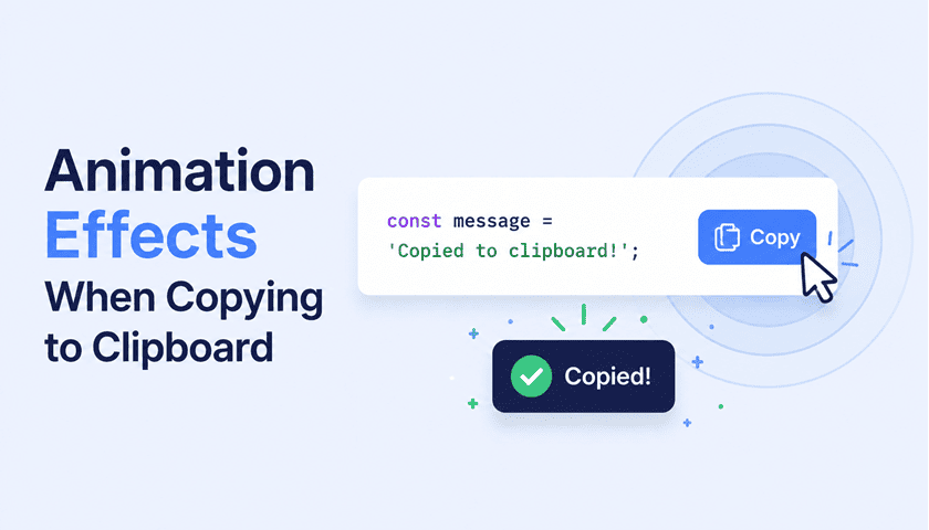
Copy-to-clipboard is one of those interactions that deserves a little ceremony. The user performed an action — let them feel it. In a previous post we explored animation effects using clipboard.js. Today we’re stripping that dependency out entirely and doing everything with navigator.clipboard.writeText(), CSS animations, and a dash of vanilla JS.
Each demo below is completely self-contained. The Clipboard API is promise-based, so we hook our animations to the .then() callback — meaning they only fire when the copy actually succeeds. Click any button to see it in action, then grab the CSS and JS code using the copy buttons on each snippet.
navigator.clipboard requires a secure context (HTTPS or localhost) and is supported in all modern browsers. No polyfill needed for most production uses.Ripple Burst
The classic Material Design interaction, applied to copy. On click, a translucent circle expands outward from the button’s centre and fades — giving instant tactile feedback. It’s universally familiar and works on any coloured button since the ripple is semi-transparent white. Requires overflow: hidden on the button to clip the circle as it grows beyond the button bounds.
<!-- Button needs position:relative + overflow:hidden -->
<button class="copy-btn"
        onclick="copyRipple(this, 'your text here')">
  <svg viewBox="0 0 24 24" fill="none" stroke="currentColor"
       stroke-width="2" width="15" height="15">
    <rect x="9" y="9" width="13" height="13" rx="2"/>
    <path d="M5 15H4a2 2 0 0 1-2-2V4a2 2 0 0 1 2-2h9a2 2 0 0 1 2 2v1"/>
  </svg>
  Copy
</button>

<!-- The .ripple-effect span is created and injected by JS -->
/* Button must be position:relative + overflow:hidden */
.copy-btn { position: relative; overflow: hidden; }

.ripple-effect {
  position: absolute;
  border-radius: 50%;
  background: rgba(255,255,255,0.55);
  pointer-events: none;
  transform-origin: center;
  animation: ripple-out 0.6s ease-out forwards;
}

@keyframes ripple-out {
  0%   { transform: scale(0);   opacity: 0.5; }
  100% { transform: scale(3.5); opacity: 0; }
}
function copyRipple(btn, text) {
  navigator.clipboard.writeText(text).catch(() => {});
  const ripple = document.createElement('span');
  const size = Math.max(btn.offsetWidth, btn.offsetHeight);
  ripple.className = 'ripple-effect';
  ripple.style.cssText = `width:${size}px; height:${size}px;
    position:absolute; top:50%; left:50%;
    margin:-${size/2}px 0 0 -${size/2}px`;
  btn.appendChild(ripple);
  ripple.addEventListener('animationend', () => ripple.remove());
}
Checkmark Swap
The most universally understood copy confirmation — the button turns green and swaps its label for a checkmark. It’s honest and clear, with a debounce guard that prevents double-firing. The key is keeping two separate label spans inside the button and toggling their visibility with a class; no JS string manipulation needed after the initial click.
<!-- Two spans inside the button — one for each state -->
<button class="copy-btn btn-check-swap"
        onclick="copyCheck(this, 'your text here')">

  <span class="label-copy">
    <svg viewBox="0 0 24 24" fill="none" stroke="currentColor"
         stroke-width="2" width="15" height="15">
      <rect x="9" y="9" width="13" height="13" rx="2"/>
      <path d="M5 15H4a2 2 0 0 1-2-2V4a2 2 0 0 1 2-2h9a2 2 0 0 1 2 2v1"/>
    </svg>
    Copy
  </span>

  <span class="label-done">
    <svg viewBox="0 0 24 24" fill="none" stroke="currentColor"
         stroke-width="2.5" width="15" height="15">
      <polyline points="20 6 9 17 4 12"/>
    </svg>
    Copied!
  </span>

</button>
.btn-check-swap .label-copy,
.btn-check-swap .label-done { transition: all 0.2s; }

.btn-check-swap .label-done        { display: none; }
.btn-check-swap.copied .label-copy { display: none; }
.btn-check-swap.copied .label-done {
  display: flex;
  align-items: center;
  gap: 6px;
}
.btn-check-swap.copied { background: #16a34a !important; }
function copyCheck(btn, text) {
  if (btn.classList.contains('copied')) return;
  navigator.clipboard.writeText(text).catch(() => {});
  btn.classList.add('copied');
  setTimeout(() => btn.classList.remove('copied'), 2000);
}
Floating Toast
A small tooltip-style bubble rises from the button, lingers briefly, then fades away. It’s great for sensitive or truncated content like API keys where the text itself isn’t visible — the toast reassures the user that something was captured. The element is created and destroyed entirely in JS, so there’s nothing persistent in the DOM between interactions.
<!-- Wrap the button in a relative-positioned container -->
<div class="toast-anchor">
  <button class="copy-btn"
          onclick="copyToast(this, 'your text here')">
    <svg viewBox="0 0 24 24" fill="none" stroke="currentColor"
         stroke-width="2" width="15" height="15">
      <rect x="9" y="9" width="13" height="13" rx="2"/>
      <path d="M5 15H4a2 2 0 0 1-2-2V4a2 2 0 0 1 2-2h9a2 2 0 0 1 2 2v1"/>
    </svg>
    Copy
  </button>
  <!-- .toast-pop div is created and injected by JS -->
</div>
/* Wrap your button in a position:relative container */
.toast-anchor { position: relative; display: inline-flex; }

.toast-pop {
  position: absolute;
  bottom: calc(100% + 8px);
  left: 50%;
  transform: translateX(-50%);
  background: #0f172a;
  color: #fff;
  font-size: 11.5px;
  padding: 5px 12px;
  border-radius: 6px;
  white-space: nowrap;
  pointer-events: none;
  animation: toast-rise 1.6s ease forwards;
}
.toast-pop::after {
  content: '';
  position: absolute;
  top: 100%; left: 50%;
  transform: translateX(-50%);
  border: 5px solid transparent;
  border-top-color: #0f172a;
}
@keyframes toast-rise {
  0%   { opacity: 0; transform: translateY(0) translateX(-50%) scale(0.85); }
  15%  { opacity: 1; transform: translateY(-12px) translateX(-50%) scale(1); }
  75%  { opacity: 1; transform: translateY(-14px) translateX(-50%) scale(1); }
  100% { opacity: 0; transform: translateY(-28px) translateX(-50%) scale(0.9); }
}
function copyToast(btn, text) {
  navigator.clipboard.writeText(text).then(() => {
    const existing = btn.parentElement.querySelector('.toast-pop');
    if (existing) existing.remove();
    const toast = document.createElement('div');
    toast.className = 'toast-pop';
    toast.textContent = '✓ Copied to clipboard';
    btn.parentElement.appendChild(toast);
    toast.addEventListener('animationend', () => toast.remove());
  });
}
Particle Burst
Ten dots explode outward from the button’s centre in a starburst pattern, each on its own trajectory calculated with a bit of trigonometry. It’s energetic and playful — better suited to casual or marketing UIs than serious developer tools. Because the particles travel outside the button’s bounds, the button needs overflow: visible instead of the usual hidden.
<!-- Add particle-btn class so overflow:visible is applied -->
<button class="copy-btn particle-btn"
        onclick="copyParticles(this, 'your text here')">
  <svg viewBox="0 0 24 24" fill="none" stroke="currentColor"
       stroke-width="2" width="15" height="15">
    <rect x="9" y="9" width="13" height="13" rx="2"/>
    <path d="M5 15H4a2 2 0 0 1-2-2V4a2 2 0 0 1 2-2h9a2 2 0 0 1 2 2v1"/>
  </svg>
  Copy
</button>

<!-- .particle spans are created and injected by JS -->
/* overflow:visible so particles escape the button bounds */
.particle-btn { position: relative; overflow: visible; }

.particle {
  position: absolute;
  width: 6px; height: 6px;
  border-radius: 50%;
  background: #93c5fd;
  pointer-events: none;
  animation: particle-fly 0.65s ease-out forwards;
}
@keyframes particle-fly {
  0%   { opacity: 1; transform: translate(0,0) scale(1); }
  100% { opacity: 0; transform: translate(var(--tx), var(--ty)) scale(0); }
}
/* --tx and --ty are set per-particle in JS */
function copyParticles(btn, text) {
  navigator.clipboard.writeText(text).catch(() => {});
  const count = 10;
  for (let i = 0; i < count; i++) {
    const p = document.createElement('span');
    p.className = 'particle';
    const angle = (i / count) * 360;
    const dist  = 28 + Math.random() * 14;
    p.style.setProperty('--tx', `${Math.cos(angle * Math.PI / 180) * dist}px`);
    p.style.setProperty('--ty', `${Math.sin(angle * Math.PI / 180) * dist}px`);
    p.style.left = '50%'; p.style.top = '50%';
    p.style.marginLeft = '-3px'; p.style.marginTop = '-3px';
    btn.appendChild(p);
    p.addEventListener('animationend', () => p.remove());
  }
}
Scanner Sweep
A glowing blue laser line sweeps across the text field while it flashes a pale blue — mimicking the feeling of content being scanned and captured. This one is applied to the snippet box rather than the button, making it perfect for JWT tokens, hash strings, or any value that feels like it should be “read” by a machine. The scan line is a simple absolutely-positioned div animated with left.
<!-- scanner-box goes on the text field, not the button -->
<div class="snippet-box scanner-box" id="scanner-target">
  your text here
</div>

<button class="copy-btn"
        onclick="copyScanner(this, 'your text here')">
  <svg viewBox="0 0 24 24" fill="none" stroke="currentColor"
       stroke-width="2" width="15" height="15">
    <rect x="9" y="9" width="13" height="13" rx="2"/>
    <path d="M5 15H4a2 2 0 0 1-2-2V4a2 2 0 0 1 2-2h9a2 2 0 0 1 2 2v1"/>
  </svg>
  Copy
</button>

<!-- .scan-line div is created and injected by JS -->
/* The text box needs position:relative + overflow:hidden */
.scanner-box { position: relative; overflow: hidden; }

.scan-line {
  position: absolute;
  top: 0; bottom: 0;
  width: 3px;
  background: linear-gradient(to bottom, transparent, #2563eb, transparent);
  pointer-events: none;
  box-shadow: 0 0 10px #2563eb, 0 0 20px #93c5fd;
  animation: scan-sweep 0.7s ease-in-out forwards;
}
@keyframes scan-sweep {
  0%   { left: -4px;             opacity: 0; }
  5%   { opacity: 1; }
  95%  { opacity: 1; }
  100% { left: calc(100% + 4px); opacity: 0; }
}
.scanner-box.scanning { animation: scan-flash 0.7s ease; }
@keyframes scan-flash {
  0%, 100% { background: #ffffff; }
  40%       { background: #eff6ff; }
}
function copyScanner(btn, text) {
  navigator.clipboard.writeText(text).catch(() => {});
  const target = document.getElementById('scanner-target');
  if (target.querySelector('.scan-line')) return;
  target.classList.add('scanning');
  const line = document.createElement('div');
  line.className = 'scan-line';
  target.appendChild(line);
  line.addEventListener('animationend', () => {
    line.remove();
    target.classList.remove('scanning');
  });
}
Slide-Up Label
The “Copy” label slides upward out of the button while “Done” rises in from below, meeting it in the middle. A springy cubic-bezier curve gives the incoming label a satisfying overshoot bounce. This is a great alternative to the checkmark swap when you want motion without a colour change — it works beautifully on both light and dark buttons.
<!-- Two spans inside the button — default label and confirmed label -->
<button class="copy-btn slide-btn"
        onclick="copySlide(this, 'your text here')">

  <span class="slide-default">
    <svg viewBox="0 0 24 24" fill="none" stroke="currentColor"
         stroke-width="2" width="15" height="15">
      <rect x="9" y="9" width="13" height="13" rx="2"/>
      <path d="M5 15H4a2 2 0 0 1-2-2V4a2 2 0 0 1 2-2h9a2 2 0 0 1 2 2v1"/>
    </svg>
    Copy
  </span>

  <span class="slide-done">
    <svg viewBox="0 0 24 24" fill="none" stroke="currentColor"
         stroke-width="2.5" width="15" height="15">
      <polyline points="20 6 9 17 4 12"/>
    </svg>
    Done
  </span>

</button>
.slide-btn { position: relative; overflow: hidden; }

.slide-btn .slide-default,
.slide-btn .slide-done {
  display: flex;
  align-items: center;
  gap: 6px;
  transition: transform 0.3s cubic-bezier(.34,1.56,.64,1), opacity 0.25s;
}
.slide-btn .slide-done {
  position: absolute;
  inset: 0;
  justify-content: center;
  transform: translateY(100%);
  opacity: 0;
}
.slide-btn.slid .slide-default { transform: translateY(-110%); opacity: 0; }
.slide-btn.slid .slide-done    { transform: translateY(0);     opacity: 1; }
.slide-btn.slid { background: #1d4ed8 !important; }
function copySlide(btn, text) {
  if (btn.classList.contains('slid')) return;
  navigator.clipboard.writeText(text).catch(() => {});
  btn.classList.add('slid');
  setTimeout(() => btn.classList.remove('slid'), 2200);
}
Border Trace
A bright blue arc sweeps clockwise around the button’s border in under a second, using a conic-gradient animated via the Houdini @property API. It’s subtle but technically impressive — CSS alone can’t normally animate a gradient, so this trick requires registering a custom property to make the percentage value interpolatable. Note that @property requires a secure context (HTTPS).
<!-- The wrapper div creates the animated border ring -->
<div class="trace-wrap" id="trace-wrap">
  <button class="trace-inner"
          onclick="copyTrace(this, 'your text here')">
    <svg viewBox="0 0 24 24" fill="none" stroke="currentColor"
         stroke-width="2" width="15" height="15">
      <rect x="9" y="9" width="13" height="13" rx="2"/>
      <path d="M5 15H4a2 2 0 0 1-2-2V4a2 2 0 0 1 2-2h9a2 2 0 0 1 2 2v1"/>
    </svg>
    Copy
  </button>
</div>

<!-- The trace animation is on .trace-wrap::before via CSS -->
/* Requires @property for animating the CSS custom property */
@property --p {
  syntax: '<percentage>';
  inherits: false;
  initial-value: 0%;
}
.trace-wrap {
  position: relative;
  display: inline-flex;
  border-radius: 10px;
  padding: 3px;
  background: #e2e8f0; /* neutral grey ring at rest */
}
.trace-wrap::before {
  content: '';
  position: absolute;
  inset: 0;
  border-radius: inherit;
  background: conic-gradient(#2563eb var(--p, 0%), transparent 0%);
  pointer-events: none;
  z-index: 0;
  opacity: 0;
}
.trace-wrap.tracing::before {
  opacity: 1;
  animation: trace-go 0.85s linear forwards;
}
@keyframes trace-go {
  from { --p: 0%; }
  to   { --p: 100%; }
}
.trace-wrap .trace-inner {
  position: relative;
  z-index: 1;
  border-radius: 7px;
  background: #2563eb;
  color: #fff;
  border: none;
  padding: 10px 18px;
  cursor: pointer;
}
function copyTrace(btn, text) {
  const wrap = btn.closest('.trace-wrap');
  if (wrap.classList.contains('tracing')) return;
  navigator.clipboard.writeText(text).catch(() => {});
  wrap.classList.add('tracing');
  setTimeout(() => wrap.classList.remove('tracing'), 950);
}
Confetti Shower
Eighteen coloured squares shower downward from the button in a burst of celebration — each with a randomised horizontal drift, fall distance, and rotation. It’s unashamedly joyful and best reserved for moments that genuinely warrant it: promo codes, referral links, successful completions. Using it on a plain code snippet would feel out of place, but on a “Share your invite link” button it’s perfect.
<!-- Wrap the button so confetti pieces have a reference point -->
<div class="confetti-anchor">
  <button class="copy-btn"
          onclick="copyConfetti(this, 'your text here')">
    <svg viewBox="0 0 24 24" fill="none" stroke="currentColor"
         stroke-width="2" width="15" height="15">
      <rect x="9" y="9" width="13" height="13" rx="2"/>
      <path d="M5 15H4a2 2 0 0 1-2-2V4a2 2 0 0 1 2-2h9a2 2 0 0 1 2 2v1"/>
    </svg>
    Copy Code
  </button>
  <!-- .confetto divs are created and injected by JS -->
</div>
/* Wrap your button in a position:relative container */
.confetti-anchor { position: relative; display: inline-flex; }

.confetto {
  position: absolute;
  top: 0; left: 50%;
  width: 7px; height: 7px;
  border-radius: 2px;
  pointer-events: none;
  z-index: 10;
  animation: confetti-fall 0.9s ease-in forwards;
}
/* --cx, --cy, --cr are randomised per piece in JS */
@keyframes confetti-fall {
  0%   { opacity: 1;
         transform: translate(var(--cx), -4px) rotate(var(--cr)) scale(1); }
  100% { opacity: 0;
         transform: translate(var(--cx), var(--cy))
                    rotate(calc(var(--cr) + 360deg)) scale(0.3); }
}
const confettiColors = ['#2563eb','#93c5fd','#fbbf24','#34d399','#f87171'];

function copyConfetti(btn, text) {
  navigator.clipboard.writeText(text).catch(() => {});
  const anchor = btn.parentElement;
  for (let i = 0; i < 18; i++) {
    const c = document.createElement('div');
    c.className = 'confetto';
    c.style.background = confettiColors[i % confettiColors.length];
    c.style.setProperty('--cx', `${(Math.random() - 0.5) * 90}px`);
    c.style.setProperty('--cy', `${40 + Math.random() * 40}px`);
    c.style.setProperty('--cr', `${Math.random() * 360}deg`);
    c.style.animationDelay = `${Math.random() * 0.2}s`;
    anchor.appendChild(c);
    c.addEventListener('animationend', () => c.remove());
  }
}
All eight of these effects share the same core pattern: call navigator.clipboard.writeText(text), then inside the .then() callback, do your animation work. That single constraint — animate only on success — is what makes these feel honest rather than optimistic.
A few tips for production use: always debounce rapid clicks (the checkmark swap and slide-up examples show this with a class guard), clean up your DOM elements via animationend events rather than setTimeout to avoid memory leaks, and for the border trace effect, make sure you’re serving over HTTPS since @property and the Clipboard API both require a secure context.
Pick the effect that matches your UI’s energy — the confetti is perfect for promo codes or moments worth celebrating, the scanner sweep fits developer tools, and the subtle ripple or slide-up work anywhere without feeling out of place.
