
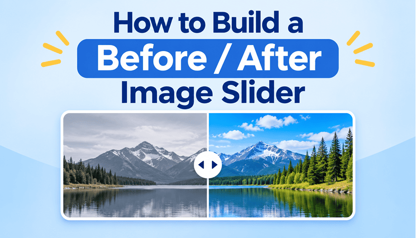
Before and after sliders are a brilliant way to show a change: a renovated kitchen, an edited photo, a website redesign or a cleaned-up logo. Two images sit on top of each other, and you drag a divider across to reveal one or the other.
In this tutorial, we'll build one step by step. Most of the work is done by CSS: a clip-path and a single custom property. A hidden range input makes it work with a mouse, touch and the keyboard, and a few lines of JavaScript tie it all together.
What we're building
Here's the finished slider. Drag anywhere on the image, or press Tab to focus it and use the arrow keys. The buttons underneath jump to set positions, and "Animate" gives it a quick swing.
How it works
The slider is built from four simple ideas:
- Two images, stacked. The "after" image sits underneath, and the "before" image sits exactly on top of it.
- A clip on the top image.
clip-pathhides part of the "before" image, letting the "after" image show through. - One custom property. A
--poscustom property controls both how much is clipped and where the divider sits, so they always stay together. - A hidden range input. An invisible
<input type="range">covers the slider. It gives us mouse, touch and keyboard support, plus screen reader support, for free.
Step 1: The HTML
The images
For this tutorial, both images are the same SVG drawing of a sunset over a lake. CSS will make the "before" copy look dull and faded. Rather than writing the drawing out twice, we define it once as a <symbol>, and show it in both places with <use>:
<!-- The shared scene: drawn once, used by both images -->
<svg width="0" height="0" style="position: absolute" aria-hidden="true">
  <defs>
    <linearGradient id="sky" x1="0" y1="0" x2="0" y2="1">
      <stop offset="0" stop-color="#ff8a5c"/>
      <stop offset=".55" stop-color="#ffd27a"/>
      <stop offset="1" stop-color="#bfe3ff"/>
    </linearGradient>
    <linearGradient id="lake" x1="0" y1="0" x2="0" y2="1">
      <stop offset="0" stop-color="#3aa0c9"/>
      <stop offset="1" stop-color="#1c5f8a"/>
    </linearGradient>
    <symbol id="scene" viewBox="0 0 600 400" preserveAspectRatio="xMidYMid slice">
      <rect width="600" height="400" fill="url(#sky)"/>
      <circle cx="420" cy="170" r="48" fill="#fff4c2"/>
      <path d="M0 260 L110 140 L190 220 L290 110 L400 240 L500 150 L600 250 V280 H0Z" fill="#6b5b95"/>
      <path d="M0 290 L90 210 L180 270 L270 200 L380 280 L470 220 L600 285 V300 H0Z" fill="#3f7d4f"/>
      <rect y="270" width="600" height="130" fill="url(#lake)"/>
      <ellipse cx="420" cy="300" rx="40" ry="5" fill="#fff4c2" opacity=".7"/>
      <ellipse cx="420" cy="318" rx="26" ry="4" fill="#fff4c2" opacity=".5"/>
      <path d="M60 330 q20 -10 40 0 M150 355 q25 -10 50 0 M470 345 q20 -8 40 0"
            stroke="#bfe3ff" stroke-width="2" fill="none" opacity=".6"/>
    </symbol>
  </defs>
</svg>
Unique ids: <use href="#scene"> finds the drawing by its id, so the ids must be unique on the page. If your page already uses sky, lake or scene, rename them. (The demo in this post uses ue-ba-scene and so on.) When you switch to real photos, you won't need this block at all.
The slider
Now the slider itself. The "after" image comes first in the HTML, so the "before" image is drawn on top of it. Then come the two labels, the divider with its round handle, and the range input. A row of buttons sits underneath:
<div class="slider" id="slider" role="group" aria-label="Before and after comparison">
  <svg class="photo after" role="img" aria-label="After: vivid sunset landscape"><use href="#scene"/></svg>
  <svg class="photo before" role="img" aria-label="Before: dull, faded landscape"><use href="#scene"/></svg>

  <span class="label before-label" aria-hidden="true">Before</span>
  <span class="label after-label" aria-hidden="true">After</span>

  <div class="divider" aria-hidden="true"><div class="handle"></div></div>

  <input type="range" min="0" max="100" value="50" step="0.1" aria-label="Comparison position">
</div>

<div class="controls">
  <button type="button" data-to="0">Show after</button>
  <button type="button" data-to="50">Reset</button>
  <button type="button" data-to="100">Show before</button>
  <button type="button" id="sweep">Animate</button>
</div>
Using your own images
If you'd rather start straight away with your own photos, use this version instead. It's exactly the same, except the two <svg> elements are replaced with <img> elements, and you won't need the hidden SVG scene above. Change the file names to match your images, and replace the alt text with a short description of each photo:
<div class="slider" id="slider" role="group" aria-label="Before and after comparison">
  <img class="photo after" src="image-after.png" alt="Describe the after image here">
  <img class="photo before" src="image-before.png" alt="Describe the before image here">

  <span class="label before-label" aria-hidden="true">Before</span>
  <span class="label after-label" aria-hidden="true">After</span>

  <div class="divider" aria-hidden="true"><div class="handle"></div></div>

  <input type="range" min="0" max="100" value="50" step="0.1" aria-label="Comparison position">
</div>

<div class="controls">
  <button type="button" data-to="0">Show after</button>
  <button type="button" data-to="50">Reset</button>
  <button type="button" data-to="100">Show before</button>
  <button type="button" id="sweep">Animate</button>
</div>
Photos need two small CSS changes, which are covered in Using your own photos below.
Accessibility details
A few accessibility details are worth pointing out:
role="group"andaria-labeltell screen readers that the parts belong together as one comparison.- Each image has
role="img"and anaria-labeldescribing it, just as an<img>would havealttext. - The labels and divider are purely visual, so
aria-hidden="true"stops screen readers from reading them out. - The range input has its own
aria-label, so screen reader users know what they're adjusting.
Step 2: Stacking and clipping the images
Stacking
The slider gets position: relative, and both images get position: absolute with inset: 0, so they fill the slider exactly, one on top of the other. aspect-ratio: 3 / 2 keeps the slider the right shape at any width.
.slider {
  --pos: 50%;                /* how much of the "before" image shows */
  position: relative;
  width: 100%;
  aspect-ratio: 3 / 2;
  overflow: hidden;
  border-radius: 14px;
  background: #fff;
  box-shadow: 0 6px 24px rgb(0 0 0 / 0.18);
  user-select: none;
  -webkit-user-select: none; /* still needed for older Safari */
  touch-action: pan-y;       /* vertical swipes scroll the page; sideways ones move the slider */
}

.slider .photo {
  position: absolute;
  inset: 0;                  /* both images fill the slider, one on top of the other */
  width: 100%;
  height: 100%;
  display: block;
}

/* "Before" sits on top, and is clipped from the right */
.slider .before {
  clip-path: inset(0 calc(100% - var(--pos)) 0 0);
  filter: grayscale(1) contrast(0.75) brightness(0.92);
}
Two smaller details: user-select: none stops text and images being highlighted while you drag, and touch-action: pan-y lets people still scroll the page with a vertical swipe on a phone, while sideways swipes move the slider.
Clipping with clip-path
The key line is the clip-path on the "before" image. The clip-path inset() function cuts a rectangle inwards from each edge, in the order top, right, bottom, left, just like margin. Only the right edge changes here:
- When
--posis30%, the right inset iscalc(100% - 30%), which is70%. The right 70% of the "before" image is cut away, and the "after" image shows through. - When
--posis100%, nothing is cut away, and you see only the "before" image. - When
--posis0%, everything is cut away, and you see only the "after" image.
Try it with two simple striped layers. Move the slider to change --pos, and watch the clip-path value change:
Finally, the filter fakes a "before" version of our drawing by removing its colour and dulling it. You'll remove this line when you use two real photos.
Step 3: The divider, handle and labels
The divider and handle
The divider is a thin white line that sits at left: var(--pos). Because the clip and the divider both use the same custom property, the line always sits exactly on the edge of the clip. transform: translateX(-50%) centres the line on that edge, and the round handle is centred on the line in the same way.
.divider {
  position: absolute;
  top: 0;
  bottom: 0;
  left: var(--pos);          /* follows the edge of the clip */
  width: 3px;
  background: #fff;
  transform: translateX(-50%);
  box-shadow: 0 0 8px rgb(0 0 0 / 0.35);
  pointer-events: none;
}

.handle {
  position: absolute;
  top: 50%;
  left: 50%;
  width: 44px;
  height: 44px;
  border-radius: 50%;
  transform: translate(-50%, -50%);
  display: grid;
  place-items: center;
  background: #fff;
  color: #333;
  box-shadow: 0 2px 10px rgb(0 0 0 / 0.35);
  font-size: 18px;
  font-weight: 700;
}

.handle::before {
  content: "‹ ›";
  letter-spacing: 2px;
}
pointer-events: none is important: it lets clicks and drags pass straight through the divider to the range input underneath it.
The labels
The "Before" and "After" labels sit in the top corners. When one image is almost completely covered, its label fades out, so it isn't left floating over the wrong picture. The JavaScript adds the hide-before and hide-after classes to trigger this.
.label {
  position: absolute;
  top: 12px;
  padding: 4px 10px;
  border-radius: 999px;
  background: rgb(0 0 0 / 0.55);
  color: #fff;
  font-size: 0.75rem;
  font-weight: 600;
  letter-spacing: 0.04em;
  text-transform: uppercase;
  pointer-events: none;
  transition: opacity 0.2s ease;
}

.before-label { left: 12px; }
.after-label  { right: 12px; }

/* Fade a label out when its image is almost fully covered */
.slider.hide-before .before-label,
.slider.hide-after .after-label {
  opacity: 0;
}
Step 4: Making it draggable
A hidden range input
Instead of writing our own drag code from scratch, we stretch a normal range input over the whole slider, and make it invisible with opacity: 0. It's still there, and still works: you can click it, drag it, focus it with Tab and change it with the arrow keys. Screen readers announce it as a slider. We just can't see it.
/* An invisible range input covers the whole slider */
.slider input[type="range"] {
  position: absolute;
  inset: 0;
  width: 100%;
  height: 100%;
  margin: 0;
  opacity: 0;
  cursor: ew-resize;
  -webkit-appearance: none;
  appearance: none;          /* lets us restyle the thumb below */
}

/* Shrink the (invisible) thumb so the value lines up exactly with the pointer */
.slider input[type="range"]::-webkit-slider-thumb {
  -webkit-appearance: none;
  appearance: none;
  width: 1px;
  height: 100%;
}
.slider input[type="range"]::-moz-range-thumb {
  width: 1px;
  height: 100%;
  border: 0;
}

/* Show keyboard users where focus is, on the visible handle */
.slider:has(input:focus-visible) .handle {
  outline: 3px solid #2f6fed;
  outline-offset: 3px;
}
Its min of 0 and max of 100 match the percentages for --pos, and step="0.1" makes the movement smooth instead of jumping a whole percent at a time.
Lining up the thumb
A range input's thumb can never move past the ends of its track, so its centre stops half a thumb-width from each edge. With a normal-sized thumb, that means the divider drifts a few pixels away from your pointer near the edges. Shrinking the invisible thumb to 1px fixes this, so the divider stays right under your finger or cursor. Chrome and Safari style the thumb with ::-webkit-slider-thumb, and Firefox with ::-moz-range-thumb. For the thumb styles to take effect, the input itself also needs appearance: none.
A visible focus style
Because the input is invisible, its focus outline would be too. The :has() selector solves this: when the slider has a focused input, we draw the outline around the visible handle instead. Using :focus-visible means the outline appears for keyboard users, but not every time someone clicks.
The buttons
The buttons underneath just need some simple styling:
.controls {
  display: flex;
  flex-wrap: wrap;
  gap: 8px;
  margin-top: 14px;
}

.controls button {
  padding: 8px 14px;
  border: 1px solid #6a6963;
  border-radius: 8px;
  background: #fff;
  color: #1c1c1a;
  font: inherit;
  cursor: pointer;
}

.controls button:hover {
  border-color: #2f6fed;
}
Step 5: The JavaScript
Updating the position
Everything goes through one function, setPos(). It updates the range input, sets the --pos custom property, and shows or hides the labels. Whenever the range input changes, we call it:
const slider = document.getElementById('slider');
const range = slider.querySelector('input[type="range"]');

function setPos(value) {
  const pos = Math.min(Math.max(Number(value), 0), 100);  // keep it between 0 and 100
  range.value = pos;
  range.setAttribute('aria-valuetext', `${Math.round(pos)}% before image`);
  slider.style.setProperty('--pos', `${pos}%`);

  // Hide a label once its image is almost fully covered
  slider.classList.toggle('hide-before', pos < 12);
  slider.classList.toggle('hide-after', pos > 88);
}

range.addEventListener('input', () => setPos(range.value));
Two small extras make it more robust. Number() turns the value into a number, because values read from inputs and data- attributes are always strings. And aria-valuetext gives screen readers a friendlier description, such as "50% before image", instead of just "50".
Dragging from anywhere
In most browsers, pressing anywhere on a range input's track jumps the thumb to that spot. Safari on iPhone has generally only let you drag the thumb itself, though, and our thumb is now just 1 pixel wide. A few lines of pointer events make dragging work from anywhere on every device:
// Move to wherever the pointer is, as a percentage of the slider's width
function moveToPointer(event) {
  const box = slider.getBoundingClientRect();
  setPos(((event.clientX - box.left) / box.width) * 100);
}

range.addEventListener('pointerdown', (event) => {
  range.setPointerCapture(event.pointerId);  // keep following the pointer, even outside the slider
  moveToPointer(event);
});

range.addEventListener('pointermove', (event) => {
  if (range.hasPointerCapture(event.pointerId)) moveToPointer(event);
});
setPointerCapture() tells the browser to keep sending pointer events to the slider until the finger or mouse button is released, even if it moves off the edge of the slider. Because the thumb is just 1 pixel wide, the browser's own handling and ours agree on the position, so they never fight.
The buttons
Each button stores its target position in a data-to attribute, so one short loop handles all three:
document.querySelectorAll('[data-to]').forEach((button) => {
  button.addEventListener('click', () => setPos(button.dataset.to));
});
The animate button
The "Animate" button swings the divider to the right, across to the left, and back to the middle. requestAnimationFrame() runs the frame() function before each screen refresh, and Math.sin() turns the progress into a smooth back-and-forth motion.
let sweepFrame;

document.getElementById('sweep').addEventListener('click', () => {
  // Skip the animation for people who have asked for less motion
  if (matchMedia('(prefers-reduced-motion: reduce)').matches) return;

  cancelAnimationFrame(sweepFrame);  // stop any sweep that's already running
  const start = performance.now();
  const duration = 2400;

  function frame(now) {
    const progress = Math.min((now - start) / duration, 1);
    setPos(50 + 45 * Math.sin(progress * Math.PI * 2));  // swing right, left, then back
    if (progress < 1) sweepFrame = requestAnimationFrame(frame);
    else setPos(50);
  }
  sweepFrame = requestAnimationFrame(frame);
});
It also checks prefers-reduced-motion, and does nothing for people who have asked their device for less motion. cancelAnimationFrame() stops an earlier sweep, so clicking the button twice doesn't start two animations fighting each other.
Using your own photos
To compare two real photos, use the <img> version of the HTML from Step 1. Keep the same classes, and give each image good alt text describing what it shows, for example "The kitchen before renovation, with dated timber cabinets".
Then add object-fit: cover, and remove the filter from the "before" image:
.slider .photo {
  object-fit: cover;   /* fill the slider without stretching */
}

/* Real "before" photos don't need the faded filter */
.slider .before {
  filter: none;
}
Matching photos: both photos must have the same aspect ratio, and ideally be taken from exactly the same spot. Otherwise, the two images won't line up at the divider. If your photos aren't 3:2, change the slider's aspect-ratio to match them, for example 4 / 3 or 16 / 9.
If the slider is far down the page, you can also add loading="lazy" to both images, so they don't load until the reader scrolls near them.
Recap
That's a complete, accessible before and after slider, built mostly with CSS. Here's what each part does:
| Part | What it does |
|---|---|
position: absolute; inset: 0 | Stacks both images exactly on top of each other |
clip-path: inset() | Cuts away part of the "before" image to reveal the "after" image |
--pos | One value that controls both the clip and the divider |
| Hidden range input | Gives mouse, touch, keyboard and screen reader support |
:has(input:focus-visible) | Shows the keyboard focus on the visible handle |
| Pointer events | Make dragging work anywhere on the image, on every device |
setPos() | Keeps the input, custom property and labels in step |
From here, you could try a vertical version, using inset(0 0 calc(100% - var(--pos)) 0) and top: var(--pos), or put several sliders on one page to show off a whole portfolio.