

In this tutorial I will show you a simple animation effect that will reveal information when you hover over an image. This information can be anything that you want, I have decided to show an example of a team member, when you hover over the image you will be able to see the persons name, short bio and links to their social media pages.
The HTML
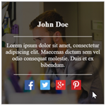
Lets first take a look at the html that will be used to display the team member and their information.
<div class="team-fade">
  <div class="team-img"><img decoding="async" alt="Team Member" src="15.jpg"></div>
  <div class="team-box">
    <div class="team-content">
      <h3>John Doe</h3>
      <hr />
      <p>Lorem ipsum dolor sit amet, consectetur adipiscing elit. Maecenas dictum sem vel odio consequat molestie. Duis et ex bibendum.</p>
      <hr />
      <div class="social-icons">
        <a href="#" target="_blank" rel="noopener noreferrer"><img decoding="async" alt="Facebook" src="facebook.png"></a>
        <a href="#" target="_blank" rel="noopener noreferrer"><img decoding="async" alt="Twitter" src="twitter.png"></a>
        <a href="#" target="_blank" rel="noopener noreferrer"><img decoding="async" alt="Google+" src="google.png"></a>
        <a href="#" target="_blank" rel="noopener noreferrer"><img decoding="async" alt="Pinterest" src="pinterest.png"></a>
      </div>
    </div>
  </div>
</div>
As can be seen, the code is broken into a number of div’s to display the required information, such as:
team-fade – The container that will be used to display all required information.
team-img – Here you will display an image of the team member.
team-content – Information about our team member will be displayed here, such as: name, bio, telephone number etc.
social-icons – Links to the team members social media accounts.
The CSS
Now comes the most important part…the css code, if we didn’t have this, our project would look terrible.
We’ll break the css code into sections to make it a bit easier to read.
.team-fade {
  width: 250px;
  height: 250px;
  border: 1px solid rgba(0, 0, 0, 0.5);
  overflow: hidden;
  display: block;
  position: relative;
}
.team-fade .team-box {
  top: 0px; left: 0px; right: 0px; bottom: 0px;
  color: #f2f2f2;
}
.team-fade .team-img {
  z-index: 0;
}
.team-fade .team-box {
  z-index: 1;
  opacity: 0;
  background-color: rgba(0, 0, 0, 0.6);
}
.team-fade:hover .team-box {
  opacity: 1;
}
The above code will display our main container (team-fade) and set the required width and height.
.team-box {
  width: 100%;
  height: 100%;
  transition:0.4s ease-in-out;
  display: block;
  transform: scale(1);
  backface-visibility: hidden;
}
.team-img img {
  display: block;
  position: relative;
  max-height: 100%;
  max-width: 100%;
}
.team-img {
  position: relative;
}
.team-box {
  top: 0px; left: 0px;
  position: absolute;
}
.team-box .team-content {
  padding: 5px;
  top: 50%; left: 50%;
  float: left;
  display: block;
  position: relative;
  transform: translateX(-50%) translateY(-50%);
}
.team-content {
  text-align: center;
}
.team-content p {
  font-size: 14px;
}
This above code is where we will set the styles for the image and information that will be displayed for the team member.
.team-content .social-icons a {
  padding: 5px;
  display: inline-block;
}
.team-content .social-icons img {
  width: 24px; height: 24px;
}
hr {
  border: 0;
  height: 0;
  width: 80%;
  border-bottom: 1px solid #f2f2f2;
}
The above code is where we will style our social media icons and also style our hr tag.
.round-team, .round-team .team-img, .round-team .team-box, .round-team .team-content, .round-team img {
  border-radius: 50%;
  overflow: hidden;
}
If you would like to display the container rounded instead of square, just add the above class – round-team
That’s it for this tutorial, to check out an working example of the above, please click on the button below.