

In today’s blog post, we’ll be looking at how to create a user-friendly and visually appealing experience by implementing CSS loaders on button clicks. Ever clicked a button and felt stuck waiting for something to happen? A well-designed loading animation can significantly improve user experience by providing visual feedback during actions that take time. Not only do loaders enhance user experience, but they’re also surprisingly easy to create using CSS! Let’s get started and explore how to add these interactive elements to your buttons.
The HTML Code
Now that we understand the benefits of using CSS loaders on buttons, let's set up the basic structure using HTML. The code we'll be using is quite simple:
<button type="submit" class="loaderbutton" id="submit">Click Me!</button>
This code snippet defines a button element with the following attributes:
- type="submit": This specifies that the button is intended for submitting a form (optional and can be omitted if not submitting a form).
- class="loaderbutton": We've assigned a class named "loaderbutton" to the button. This class will be used later in our CSS styles to target and style the button, including the loader animation.
- id="submit": An id attribute is assigned with the value "submit". While not strictly necessary for this example, IDs can be useful for more specific targeting with JavaScript if needed.
The text content within the opening and closing <button> tags defines the label displayed on the button ("Click Me!" in this case).
In the next section, we'll look at the CSS to create the actual loading animation for this button.
The CSS Code
We've established the basic button structure with HTML. Now, let's bring it to life with some CSS magic! Here's the code that will style the button and create the loading animation:
.loaderbutton {
  padding: 10px 30px;
  background: #3e52c1;
  border: none;
  color: #fff;
  border-radius: 5px;
  cursor: pointer;
  font-size: 1.2em;
  position: relative;
  display: block;
}

.loaderbutton::after {
  content: '';
  display: block;
  width: 1.1em;
  height: 1.1em;
  position: absolute;
  left: calc(50% - 0.75em);
  top: calc(50% - 0.75em);
  border: 0.2em solid transparent;
  border-right-color: white;
  border-radius: 50%;
  animation: loader-animation 0.7s linear infinite;
  opacity: 0;
}

@keyframes loader-animation {
  from {
    transform: rotate(0);
  }
  to {
    transform: rotate(360deg);
  }
}

.loaderbutton.loading {
  color: transparent;
}

.loaderbutton.loading::after {
  opacity: 1;
}
Let's break down what this code does:
- Styling the Button (.loaderbutton):
- This block defines styles for the button element with the class "loaderbutton".
- Properties like
padding,background,border,color, andfont-sizedefine the button's appearance.
- Creating the Loader Element (.loaderbutton::after):
- This uses the CSS pseudo-element
::afterto create a hidden element positioned within the button. - We define its size, position, and a border that creates a circle using
border-radius. - The
animationproperty references theloader-animationkeyframes to create the rotation effect. - Initially, the opacity is set to 0 (
opacity: 0), making it invisible.
- Animation Definition (@keyframes loader-animation):
- This defines the animation named
loader-animation. - It specifies a rotation from 0 degrees to 360 degrees, creating a spinning motion.
- The animation duration is set to 0.7 seconds with a linear timing function (
0.7s linear).
- Activating the Loader (.loaderbutton.loading):
- This block targets the button element with the class "loaderbutton" that also has the additional class "loading".
- When this class is added, the button text color becomes transparent (
color: transparent). - This allows the loader animation to become visible.
- Showing the Loader (.loaderbutton.loading::after):
- This targets the pseudo-element within the button that has both "loaderbutton" and "loading" classes.
- When the "loading" class is added, the opacity is set to 1 (
opacity: 1), making the loader animation visible.
By combining these styles, we achieve a button that displays a loading animation (spinning circle) when the "loading" class is added. In the next section, we'll explore how to use JavaScript to control this behavior based on button clicks.
The JavaScript Code
We've styled the button and created the loading animation using HTML and CSS. Now, it's time to make it interactive! JavaScript will allow us to control the loader animation based on user interaction (clicking the button). Here's the code that brings it all together:
const animBtn = document.getElementById("submit");

animBtn.addEventListener('click', () => {
  animBtn.classList.add("loading");
  //The following is used for demo purposes only//
  setTimeout(() => animBtn.classList.remove("loading"), 5000);
});
Let's understand what this code does:
- Get Button Reference (const animBtn):
- This line uses
document.getElementById("submit")to select the button element with the ID "submit" and assigns it to a constant variable namedanimBtn.
- This line uses
- Add Click Event Listener:
- This line uses
animBtn.addEventListener('click', () => { ... })to attach a click event listener to the button element referenced byanimBtn. - The part within the curly braces (
{}) is a function that will be executed when the button is clicked.
- This line uses
- Add and Remove Loading Class:
- Inside the event listener function, we use
animBtn.classList.add("loading")to add the class "loading" to the button element. - This class addition triggers the CSS styles defined earlier to show the loader animation and hide the button text.
- Important Note: The commented line (
//The following is used for demo purposes only//) usessetTimeoutto simulate a 5-second delay before removing the "loading" class. This is for demonstration purposes only. In your actual application, the button should return to its normal state after the intended action is complete.
- Inside the event listener function, we use
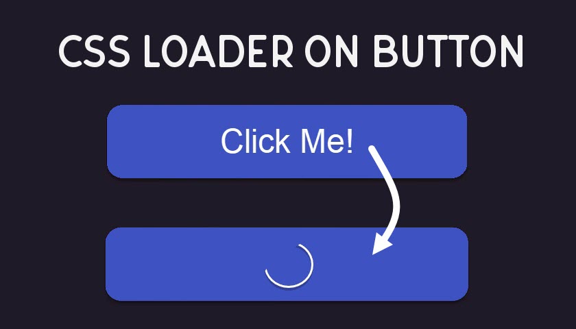
The Result
Now that we've implemented all the code snippets, let's see the final outcome! With this code in place, clicking the button will trigger the following sequence:
- Button Clicked: Clicking the button fires the event listener function we defined in JavaScript.
- "Loading" Class Added: The JavaScript code adds the class "loading" to the button element.
- CSS Activated: The CSS style associated with the "loading" class takes effect.
- Loader Animation Shown: The hidden loader animation element becomes visible due to a change in opacity.
- Button Text Hidden: The button text color becomes transparent, effectively hiding the original button text.
Remember: The commented line in the JavaScript code using setTimeout is for demonstration only. In your application, you'll want to remove the "loading" class after your intended action is complete (e.g., data submission is finished). This will make the button return to its normal state.
By following these steps, you've successfully created a user-friendly button that provides visual feedback using a CSS loader animation during clicks!