

When working with CSS, one of the most common layout questions developers face is whether to use margin or padding. Both add space, but they do it in very different ways. Margin creates space outside an element, separating it from its neighbors, while padding adds space inside an element, pushing its content inward. Understanding how these two properties work—and when to use each—is essential for creating clean, consistent, and visually appealing layouts.
In this guide, we’ll break down the CSS box model, explore the differences between margin and padding, compare real-world use cases, and look at common pitfalls to avoid. By the end, you’ll have a solid, practical understanding of how to apply spacing confidently in your designs. Don’t forgot to view our pages for CSS margin property and CSS padding property.
The Box Model Basics
To understand margin and padding, it helps to start with the CSS box model—the foundation of how elements are sized and spaced on a webpage. Every element you see in the browser is represented as a rectangular box made up of four layers:
- Content – The text, image, or other data inside the element.
- Padding – The space between the content and the element’s border.
- Border – The line (visible or invisible) that surrounds the padding and content.
- Margin – The outermost layer, creating space between the element and surrounding elements.
These layers work together to determine how much space an element occupies and how it interacts with other elements around it. When you adjust padding or margin, you’re not just adding visual space—you’re influencing the entire layout.
Understanding this model is key because it affects how your layouts respond, stack, and scale. With the basics in place, you’ll be able to clearly see how margin and padding play their distinct roles.
What Is Margin in CSS?
Margin is the space outside an element’s border. It controls how far an element sits from its neighboring elements, making it an essential tool for managing spacing and layout structure.
Margins don’t affect the size of the element itself—they only influence its positioning within the surrounding layout. This makes them ideal for creating consistent spacing between sections, cards, buttons, or any block-level components.
How Margins Work
- Margins push elements away from each other.
- They create external whitespace.
- They can be set individually for each side (
margin-top,margin-right,margin-bottom,margin-left) or using shorthand (margin: 20px 10px;).
Margin Collapsing
One important detail: vertical margins can collapse.
This means when two block elements sit on top of each other, the larger of the two margins is used instead of adding them together.
For example:
div + div {
  margin-top: 20px; /* Only 20px gap appears even if both have margin-top */
}
Horizontal margins, however, never collapse.
Margin Shorthand Examples
margin: 20px;          /* all sides */
margin: 10px 20px;     /* top/bottom, left/right */
margin: 5px 10px 15px; /* top, left/right, bottom */
margin: 5px 10px 15px 20px; /* top, right, bottom, left */
Margins are best used when you want to control the spacing around elements without changing their internal visual structure.
What Is Padding in CSS?
Padding is the space inside an element—between the content and the border. While margins control how much room an element has on the outside, padding controls the breathing room within the element itself.
Adding padding effectively enlarges the clickable or readable area of an element. This makes padding especially important for buttons, form fields, cards, and any component where the content needs comfortable spacing.
How Padding Works
- Padding increases the space between the element’s content and its border.
- Padding affects the element’s total size unless
box-sizing: border-boxis used. - Like margins, padding can be set on each side or via shorthand.
Padding Does Not Collapse
Unlike margins, padding never collapses.
Each element’s padding is fully respected, and layers of padding stack as expected.
Padding Shorthand Examples
padding: 20px;          /* all sides */
padding: 10px 20px;     /* top/bottom, left/right */
padding: 5px 10px 15px; /* top, left/right, bottom */
padding: 5px 10px 15px 20px; /* top, right, bottom, left */
Impact on Element Size
Padding increases an element’s total width and height by default:
total width = width + left padding + right padding + border
total height = height + top padding + bottom padding + border
If you want padding to stay inside the element’s declared size, you can use:
box-sizing: border-box;
This keeps the element’s total size consistent regardless of padding.
Margin vs Padding: Key Differences at a Glance
Margin and padding both create space, but they do it in very different ways. Understanding when to use each is essential for building clean, predictable layouts. Here’s a quick side-by-side comparison to make the differences crystal clear.
Comparison Table
| Feature | Margin | Padding |
|---|---|---|
| Location | Outside the border | Inside the border |
| Affects Element Size? | No | Yes (unless using box-sizing: border-box) |
| Creates Space For… | Separation between elements | Space around the element’s content |
| Collapses? | Vertical margins can collapse | Never collapses |
| Used For | Layout spacing between components | Improving readability and touch/click comfort inside elements |
| Allows Negative Values? | Yes | No |
| Part of Background? | No — backgrounds don’t extend into margins | Yes — backgrounds extend under padding |
When to Choose Which
- Use margin to separate one element from another.
- Use padding to add breathing room inside an element.
- If spacing affects layout structure → margin
- If spacing affects content comfort or visual balance → padding
This simple distinction helps keep your UI consistent and prevents layout issues that happen when the two are mixed incorrectly.
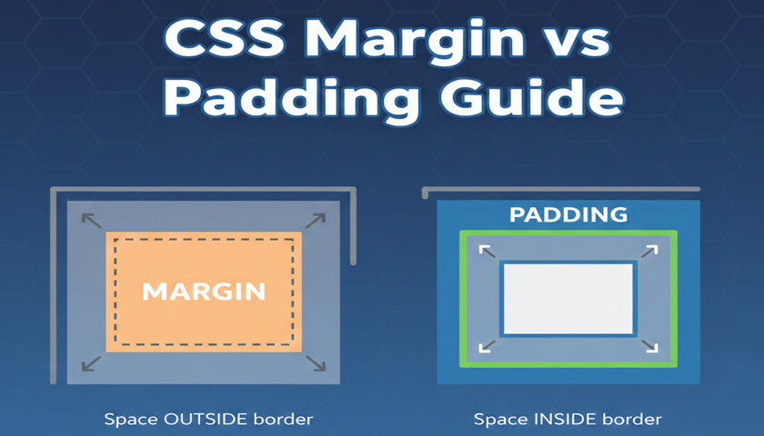
Visual Examples (With Diagrams)
Understanding margin and padding becomes much easier when you can see how they affect an element. Below are simple visual diagrams to help illustrate the difference between spacing inside and outside an element.
Box Model Diagram

This diagram shows how each layer wraps around the next:
- Content is at the center
- Padding surrounds the content
- Border surrounds the padding
- Margin is the outermost space
Margin Example

Here, the extra space sits outside the box, separating the element from others around it.
Padding Example

In this case, padding expands the area inside the element, making the content feel more spacious.
Using Colors to Visualize in CSS
You can also test this visually in your editor:
.box-example {
  background: lightblue;
  padding: 20px;
  border: 2px solid blue;
  margin: 20px;
}
Box Example, 20px Padding + 20px Margin
With background colors applied:
- Padding space appears as part of the colored box
- Margin space appears outside the box and stays uncolored
These simple visuals are often the easiest way for beginners to grasp margin vs padding instantly.
When to Use Margin vs Padding
Margin and padding often appear interchangeable at first glance, but choosing the right one can dramatically improve the clarity, consistency, and maintainability of your layout. Here’s a simple guide to help you decide which spacing tool fits each situation.
Use Margin When…
1. You Need Space Between Elements
Margin creates separation from outside elements, making it ideal for:
- Spacing between sections
- Gaps between cards, list items, or blocks
- Creating breathing room between unrelated components
2. You Want Layout-Level Control
Margins push elements away from each other. They’re perfect for tuning the structure of your page.
3. You Need Negative Space Adjustments
Margins can be negative, which allows you to:
- Pull elements closer together
- Overlap elements intentionally
- Fine-tune tight layouts
Use Padding When…
1. You Want Space Inside the Element
Padding is the internal cushion that improves readability and usability:
- Button text needs breathing room
- Headings or paragraphs look cramped
- Cards or containers need a soft, comfortable inner layout
2. You Want to Increase Clickable/Tappable Areas
More padding = larger hit area.
This is essential for:
- Buttons
- Form inputs
- Navigation links
3. You Want Backgrounds to Expand with the Content
Because background colors and images extend into padding, it’s ideal for:
- Badges or tags
- Highlighted blocks
- Alerts, cards, or callouts
Quick Rule of Thumb
- Margin = spacing outside
- Padding = spacing inside
If the spacing affects the surrounding layout → Margin
If the spacing affects the content within the element → Padding
Advanced Tips and Gotchas
Even once you understand the basics of margin and padding, there are some subtle behaviors and lesser-known rules that can impact how elements are displayed. Knowing these helps you avoid layout bugs and write cleaner, more predictable CSS.
1. Margin Collapsing: The Unexpected Space Saver
Vertical margins collapse when two block-level elements meet.
This can cause confusion when:
- A parent and its first/last child both have margins
- Two stacked elements have top/bottom margins
- Empty elements have margins
Tip:
If you want to prevent collapsing, add:
- Padding to the parent
- A border
overflow: auto(or another non-visible overflow value)
2. Negative Margins: Powerful but Easy to Misuse
Negative margins can pull elements closer together or even overlap them.
Common uses:
- Fine-tuning overlapping elements
- Pulling headings closer to images
- Creating more dynamic layouts
But be cautious—overusing negative margins can make layouts behave unpredictably across breakpoints.
3. Box-Sizing Makes Padding Easier
By default (box-sizing: content-box), padding increases the total size of an element.
Switching to:
* {
  box-sizing: border-box;
}
ensures:
- Padding stays inside the declared width/height
- Layouts are easier to manage
- Components remain consistent and modular
This is a widely adopted best practice in modern CSS.
4. Auto Margins for Centering
Margins can do more than create space—they can also position elements.
margin: 0 auto is the classic way to center block-level elements with a defined width:
.container {
  width: 80%;
  margin: 0 auto;
}
This technique is still used everywhere in responsive design.
5. Padding Shapes Backgrounds, Margin Does Not
Remember:
paddingexpands the backgroundmargindoes not affect background or border
This becomes especially important when designing:
- Buttons
- Cards and panels
- Alerts and highlighted content
6. Percentages Behave Differently
Margins and padding accept percentage values—but they’re both calculated from the width of the containing block, not the height.
This can surprise developers when using:
padding-top: 50%;
It creates responsive height proportional to the width, which is a popular technique for responsive squares and video containers.
7. Understanding the “Last Margin Wins” Issue
Sometimes two elements both have bottom and top margins that collapse. The larger of the two applies, which may look like your smaller margin was ignored.
If precise spacing is crucial, use padding or a border to prevent margin collapse.
8. Inline Elements Ignore Vertical Margins
Inline elements (like <span>) respect horizontal margins but mostly ignore vertical ones.
If you need vertical spacing:
- Switch to
display: inline-block - Or apply padding instead
These advanced margin and padding behaviors can greatly influence your layout—especially in larger, component-based designs. Keep them in mind to prevent spacing bugs and ensure consistency across your UI.
Conclusion
Mastering the difference between margin and padding is one of the most important steps toward writing clean, predictable, and professional CSS. While both properties control spacing, they do so in very different ways—margin separates elements from the outside, while padding creates comfortable space on the inside.
By understanding how these properties fit into the CSS box model, recognizing when to use each, and watching out for common pitfalls like margin collapsing or box-sizing behavior, you gain full control over layout structure and visual balance. Whether you're styling simple components or building complex UI systems, consistent spacing is what ties everything together.
With these concepts in hand—and the cheat sheets and diagrams as quick references—you’ll be well-equipped to create interfaces that feel polished, readable, and user-friendly. The more you practice applying margin and padding intentionally, the more intuitive and powerful CSS layout becomes.